
Customize Dashboard
Last Updated: Nov 20, 2020

Last Updated: Nov 20, 2020
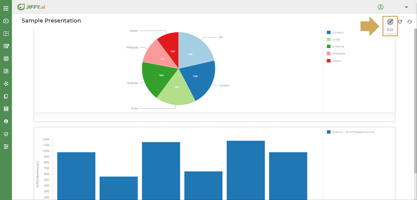
Click on the Edit button to edit the Dashboard.
Click on More Button(Vertical 3 dots) to customize Dashboard.
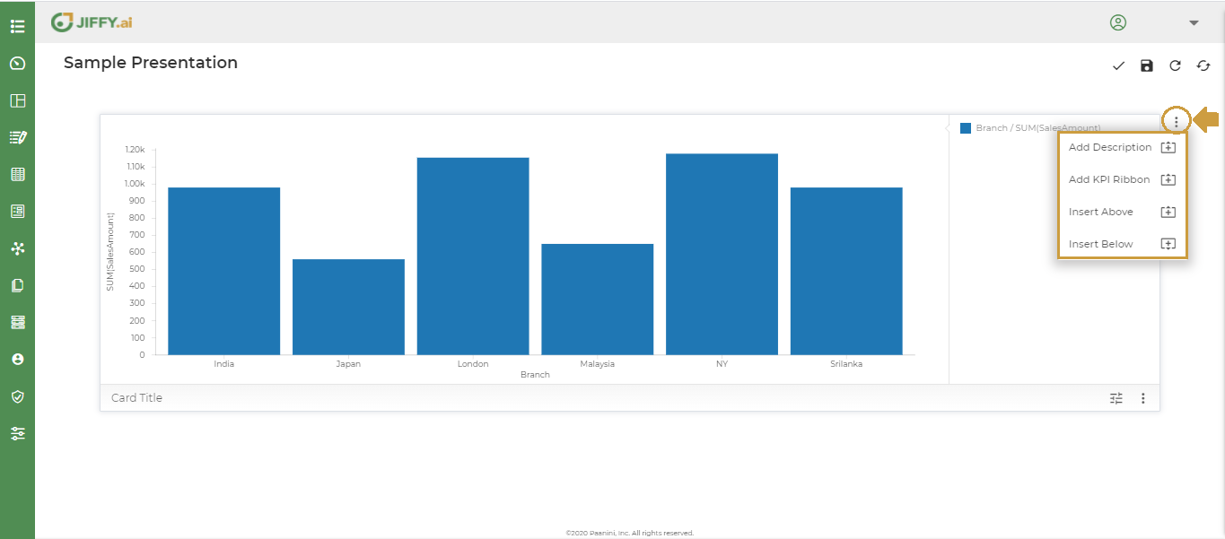
A popup screen appears with the following options
With this option the user can give a meaningful description for the presentation.
KPI Ribbon is used to add Key Performance Indicators on the critical fields of the Business to have a summarised view.
A Dropdown with opions (1, 2, 4) is shown. The user can add as many KPI Ribbons.
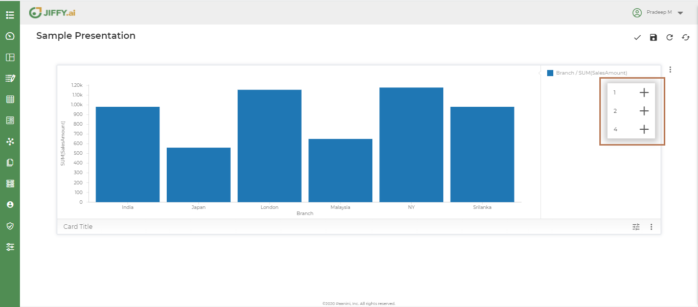
Click on 1 icon(Option1) from the dropdown, to add one Ribbon tag for the dashboard as shown below.

Click on the Title and edit the ribbon title. E.g.: Branches
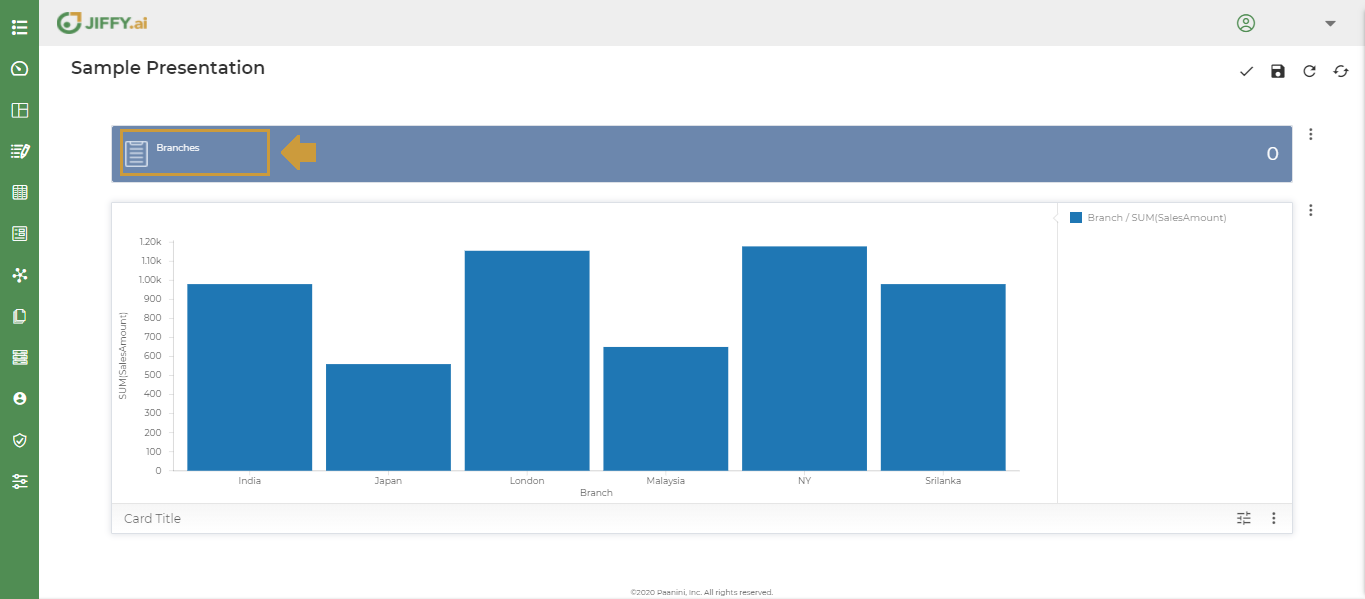
Choose any field for the Indicator. E.g.: To have number of branches as Indicator. Select Branch Field.
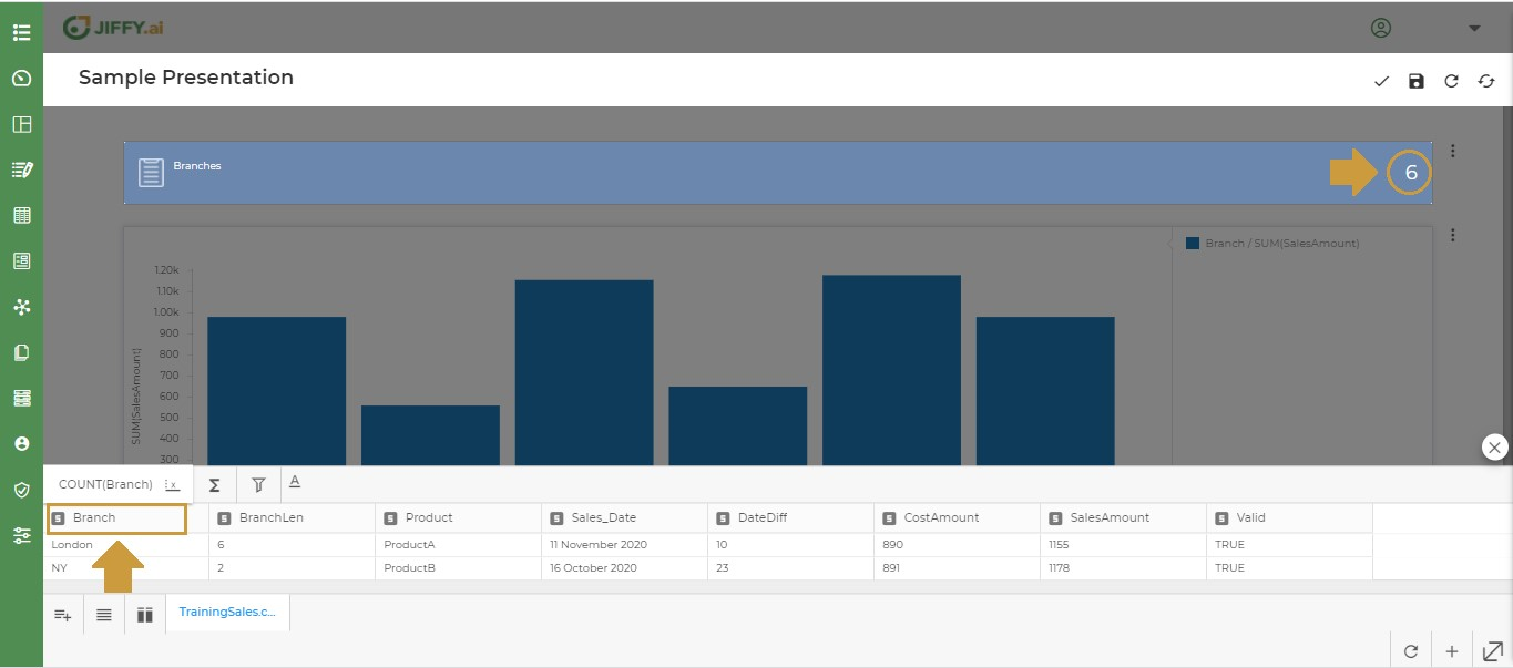
Click on 2 icon(Option2) from the dropdown, Two Ribbon tags will be added. With this user can set two Indicators as shown below. E.g.: Number of Branches and Number of Products.

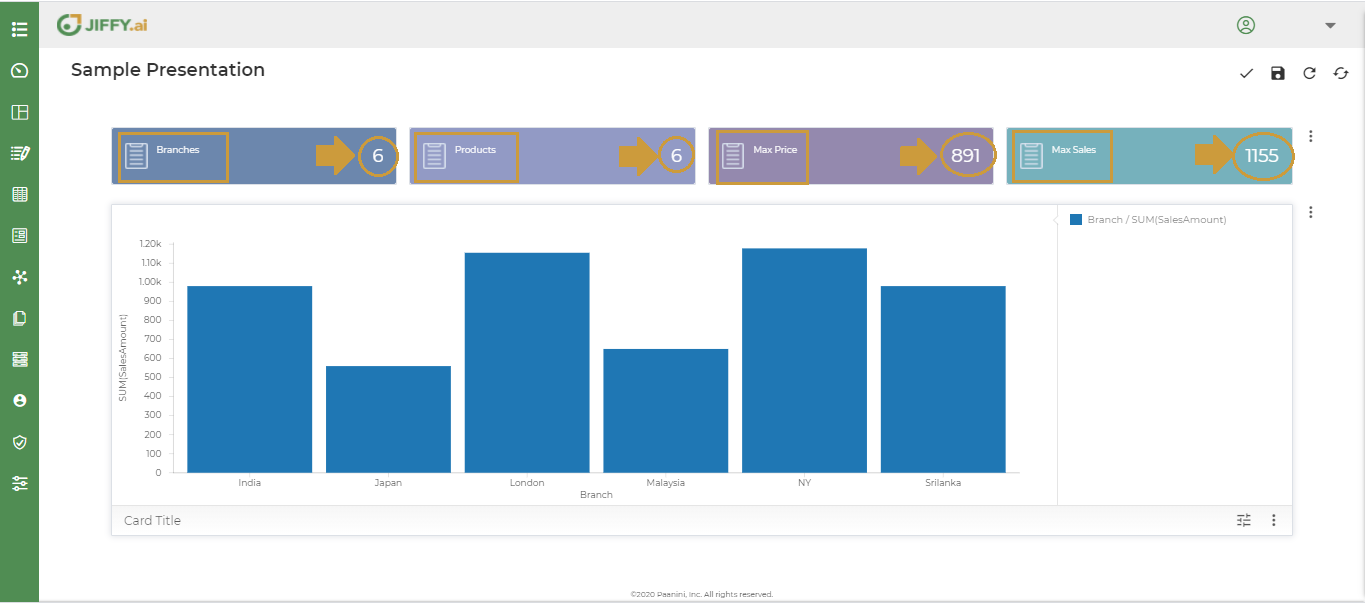
Click on 4 icon(Option3) from the dropdown, Four Ribbon tags will be added. With this user can set four Indicators as shown below. E.g.: Number of Branches, Number of Products, Max Product Price and Max Sales as Indicators.
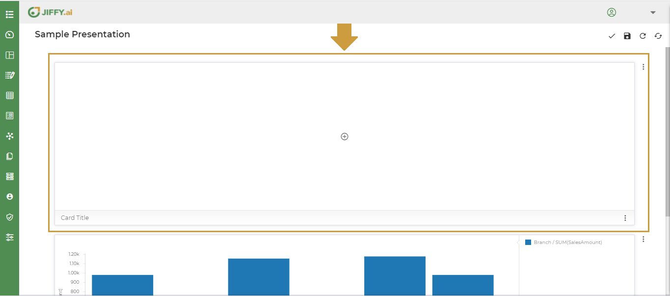
User can create one more presentation above the card.
Click on the + icon, select the card type and follow the steps to create Presentation.
Refer to Create Presentations to know more.
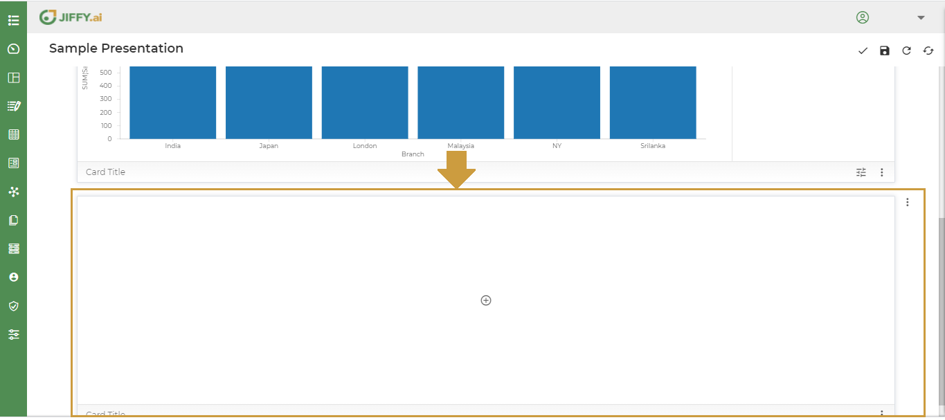
User can create one more presentation below the card.
Click on the + icon, select the card type and follow the steps to create Presentation.
Refer to Create Presentations to know more.
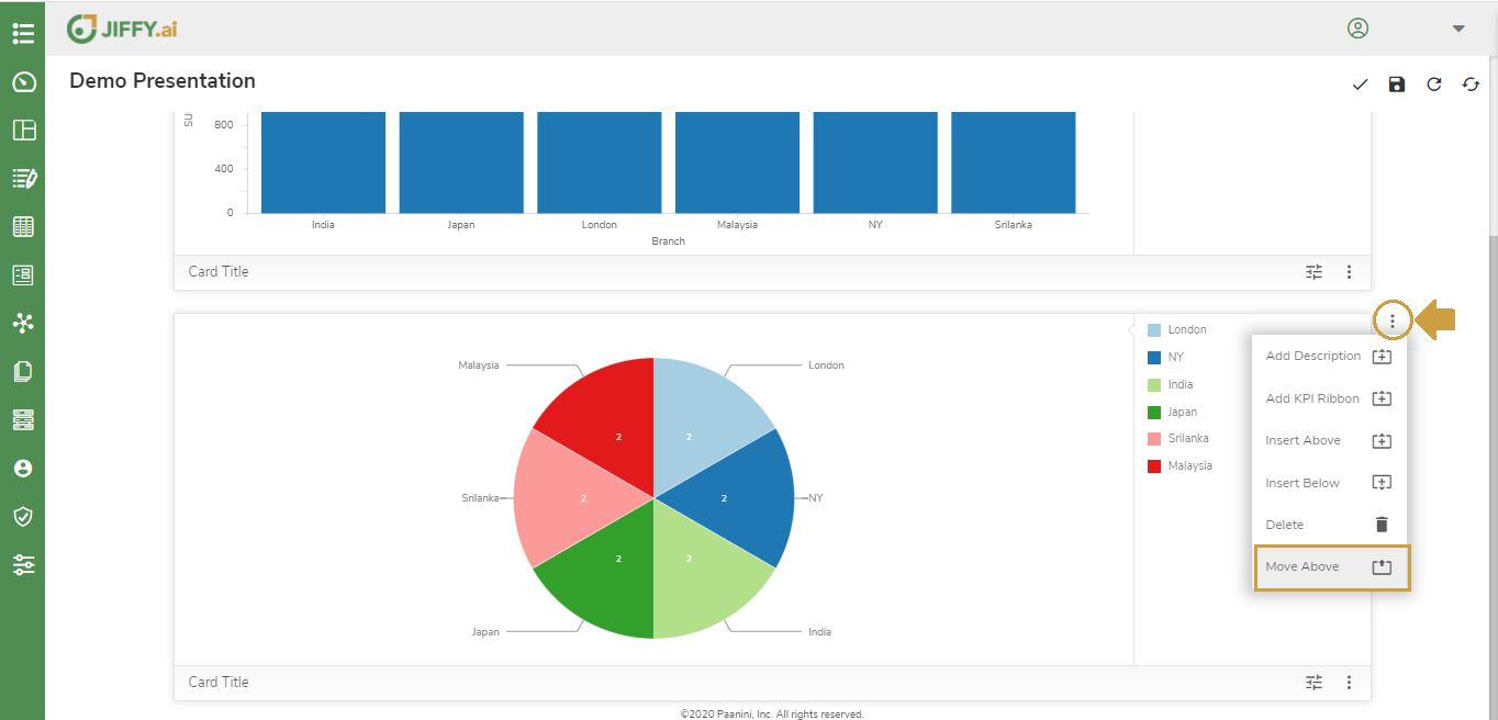
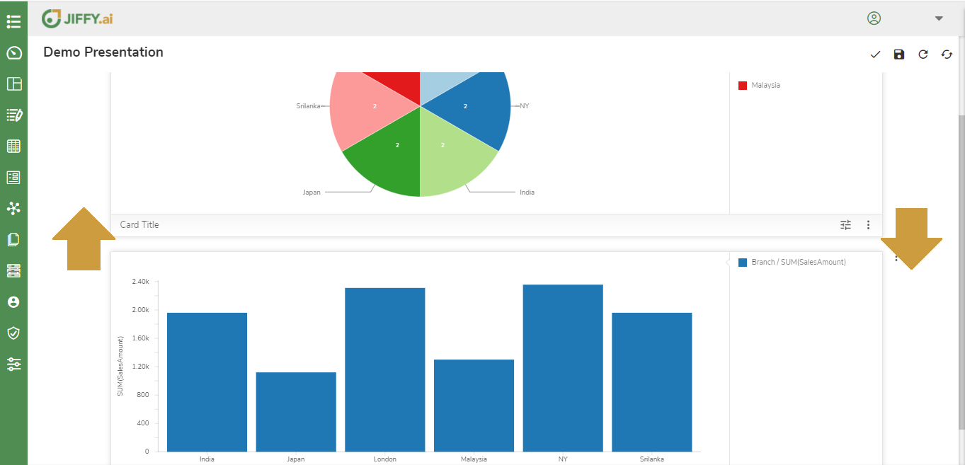
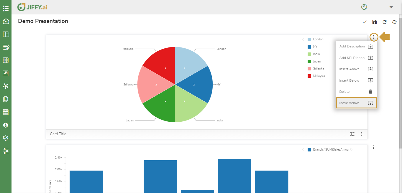
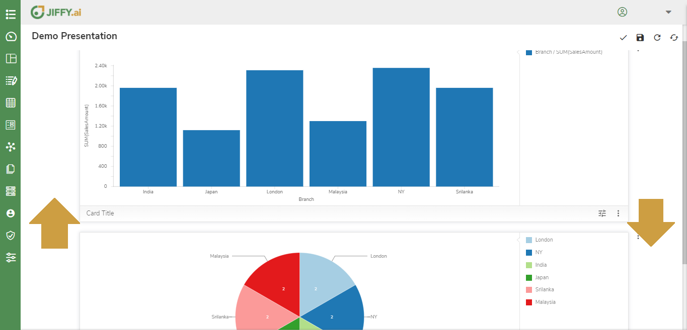
User can move the card from Above to Below position and vice versa.
Click on the More Button(Vertical 3 dots)
User can delete the card from the dashboard.
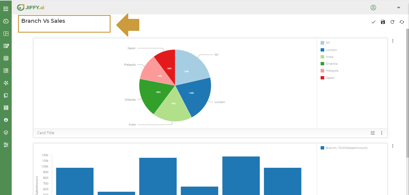
Refresh the presentation such that the changes in the underlying datasets also reflect in the presentations. The data displayed in the presentations will be the latest as in the datasets.
The user can replace the existing dataset in the presentation with some other dataset.