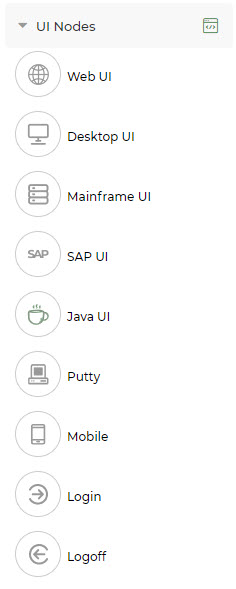
The UI nodes section contains the following nodes:
- Web UI: The Web UI node is used to automate web-based applications.
- Desktop UI: The Desktop UI node is used to automate the user interface of any desktop applications like notepad, wordpad etc.
- SAP UI: The SAP UI node is used to automate the SAP applications which contains data grids, tables, and trees.
- Java UI: The Java UI node is used to automate the user interface of any Java Applications.
- Putty: The Putty UI node is used to automate the Putty application by using different connection types (SSH,PCSHLL,TELNET).
- Login and Logoff: Login and logoff nodes are used to automate any node which runs on the bots without hindering the machine.
To automate any UI application, there are 3 steps.
- Familiarizing the application
- Designing the application
- Designing a task to execute the application
Steps 1 & 3 are explained in their respective nodes section. Step 2 is described in the below section as it is applicable to all nodes in same manner.
Designing The Actions
All the events that are familiarized from the UILearn for the App will be listed under Actions tab of the node. These events can
further be edited to perform the required activities.
Do the following to edit the lines of action so that an application is automated:
- Click on the Actions tab.
- The lines of action are displayed with default UI Event option in the first drop-down. This drop-down allows the user to select any of the following options:
- UI Event: All the familiarized UI controls are displayed in this drop-down. For the UI Event option, the following UI controls
can be selected for the specific module. The drop-down corresponding to UI control contains the following options as applicable:
- Check: Used to clear a checkbox.
- Checked: Used to check whether a checkbox is checked or not.
- Clear: Clears the existing content in the field.
- Click: When the required UI action to be performed is a “click on the UI control” then select this option.
- ClickByOffset: As the click action is performed on the mid-point of the screen, the ClickByOffset option allows the user to perform click action at the desired position of the screen by specifying a value.
- -200: Moves the cursor from the mid-point of the screen to the left side by 200 px.
- +200: Moves the cursor from the mid-point of the screen to the right side by 200 px.
- DoubleClick: When the required UI action to be performed is a “double-click on the UI control” then select this option.
- ExistsWithImplicitDelay: Used to check for an UI event every 3 seconds. If the event does not exist, it waits for 15 seconds and times out post that.
- Exists: Used to check whether the UI event exists or not.
- Focus: Used to select a UI event before performing other actions on it.
- GetTableData: Used to get the data in the table of any UI event. Currently Jiffy supports only Get Table Data option for the table type controls.
- GetText: Used to get the text value of any UI event.
- Hover: Used to perform mouse hover on a component.
- Input: Used for providing inputs to an UI event, for example: Username
- InputPassword: Used to input a password in the text field.
- Keyboard: Use this option when any key has to be pressed from the keyboard, for example: Enter key.
- RightClick: Used to right click on a component.
- Uncheck: Used to uncheck an already checked checkbox.
- Virtual Input: Used to enter data in non-editable fields (For Ex: A field with a date picker) directly during the task design.
- VirtualClick: Used to click an element that is not visible in the current screen layout.
If a “Submit” button is present at the end of a Desktop page, it can be clicked when it is currently not seen on the screen, using this action.
- Screen: Select the required module from this drop-down. All the controls of a Desktop application are grouped together as a module during familiarization, for example, all the login Desktop page controls are grouped in login module.
- Set Variable: There is an option to set a variable inside the UI node. The value to be set can either be a new variable or an existing variable (output variable created in the Properties tab). Read more Variables here.
- User Defined Function: Jiffy provides a feature to allow users to create custom Python functions and use them in the UI nodes steps. Read more about-ui-nodes User Defined Functions here.
- Predefined Function: These are Jiffy provided python functions for the commonly used functions. For example: Concat, Capitalize,
Add days etc. Read more Predefined functions here.
- UI Component: Click here for
details on UI components.
- As the first step, always select the Screen option and select the required module. option and select the required module.
- Based on the configuration, all the modules that are familiarized are listed in the drop-down.
- Design the steps to replicate the manual flow.
The Tool Bar of the Actions tab has the following options:
- Start Recording: On clicking the Start Recording button, the UILearn floating window opens and starts the familiarization of all the
actions of the application mentioned in the configuration details. Any additional steps can also be familiarised here.
- Copy: Single line or multiple lines of actions can be copied to the clipboard by selecting the line/lines of actions by checking the
checkbox/checkboxes of the desired line/s of actions and then clicking the Copy button on the toolbar. The lines need to be selected in a
sequential order, they cannot be select randomly.
- Comment: The line/lines of actions that are not in use or not required can be commented using this option. To comment a line of
action, do the following:
Select the desired line of action by checking the checkbox provided against each line. Multiple lines of actions can be selected by clicking on the checkboxes of the desired lines of actions. Click on the Comment button in the toolbar.
The line/s of action is/are commented then the Comment button will be disabled and the Uncomment button is enabled only for that selected line/s. Upon hovering the disabled Comment button, a tooltip appears The line is commented already.
- Uncomment: The line/lines of actions that are commented can be uncommented. To uncomment a line of action, do the following:
Select the desired line of action by checking the checkbox provided against each line. Multiple lines of actions can be selected by clicking on the checkboxes of the desired lines of actions. Click on the Uncomment button in the toolbar.
Once the line/s of action is/are uncommented then the Uncomment button will be disabled, and the Comment button is enabled only for that selected line/s. Upon hovering the disabled Uncomment button, a tooltip appears The Lines are not commented yet
- Debug: Explained here.
- Select all/Deselect all: To select or deselect all of the lines of action at once.
Upon hovering on every line of actions under the Actions Tab, the following options appear:
- + icon (I): To add lines of actions.
- While: To add a “while” condition to a group of statements so that according to the specified conditions, the execution moves forward to the next lines of action. While adding the While option in the actions tab, a line for End While appears automatically to represent the end of the While loop. The lines of actions between the While and End While are indented automatically to represent the lines of actions belong to the While block. The condition to the ** loop can be variables or constants or inline expressions.
- If: To add an “if” condition to a group of statements so that according to the specified conditions, the execution moves forward to the next lines of action. While adding the If option in the actions tab, lines for Else and End If appear automatically and separately to represent the Else part and the end of If respectively. The lines of actions between the If and End IF are indented automatically to represent the lines of actions belong to the If block. The conditions to the If block can be variables or constants or inline expressions.
- Iterate On: To add a “for each” while condition to a group of statements so that according to the specified conditions, the execution moves forward to the next lines of action. While adding the Iterate on option, a line for End Iterate On appears automatically to represent the end of Iterate On condition.
- – icon (II): To remove the lines of actions.
More Actions (III): Upon clicking on the More options we get on hovering any line of action, the following options are
- Paste below: To paste the copied line/lines of action at the desired location. Upon clicking this option on the desired line of
action, the copied line/lines of action will be pasted below to that line of action.
- Execute Till: To execute the task till the selected line of action. Hovering on any line of action and clicking the Execute Till button, either of the two actions happen:
- Debugging starts from the first line of action till the hovered line, if no lines are executed in the Actions Tab.
- Debugging starts from the previous line of action that has been executed up to in the Actions tab. This helps in checking the errors upon any task execution failure.
When the Execute Till option is clicked from the 6th line of action, the debugging cursor shows up and starts executing from the first line of execution up to the 6th line and the debugging stops.
Debugging Cursor (Red): The debugging cursor (1) in the Actions Tab of the Attributes Pane represents the line of failure or is used for debugging purpose upon failure of the task execution. The debugging cursor is visible only after the first execution of the task is performed and it will exist for subsequent execution until the task execution is successful. The debugging cursor gets placed in between the two lines of actions at the point of failure.
- Recording Cursor (Green): The recording cursor (2) which is in green colour appears in the Actions Tab of the Attributes Pane for adding lines of events by recording UI Control and its appropriate actions. The recording cursor appears only after the initial recording from the configuration tab or action tab is completed. The cursor can be dragged and dropped at a desired place and then clicking on the record button, UI learn floating window comes up for recording any new UI event. For an existing task, the location of the last recording is saved along with the task so that when the task is again opened, the user can continue to work from the previous point of recording.
Debug
A step-wise execution of the recorded actions can be performed using the Debug option. Upon clicking the Debug button, the debug of lines of actions starts getting executed and the following actions takes place in different scenarios:
- Scenario 1: Debug steps in a node that does not have any input mapping from previous node.
- Here, after clicking the Debug button, the task will execute without any popup message.
- Scenario 2: User needs to debug steps in a node that required input data from previous nodes and that node needs to be iterated, assuming that task is not executed yet.
- After clicking the Debug button, a message Input data is not available. Do you want to execute from the beginning? is displayed in a pop-up window to show the user that the input data is not available and the task needs execute from beginning.
- If the user clicks on the No button in the pop-up, the user can’t perform debug on that node.
- If the user clicks on the YES button in the pop-up, the task gets executed from the beginning and it will stop at the debug node after executing first step.
- Then the user can click the Debug button again and choose the iteration number for execution further debugging.
- Scenario 3: User needs to debug steps in a node that requires input data from previous nodes and the task doesn’t have any iterating node, assuming that task is not executed yet.
- After clicking the Debug button, a message pops-up to show the user that input data is not available and the task needs execute from beginning.
- When the user clicks on the YES button, the task will execute from the beginning and execute the steps in debug node until the Execute until bar is shown.
- Scenario 4: User needs to debug steps in a node that requires input data from previous nodes and that node needs to be iterated, assuming that task is already executed once.
- After clicking Debug button user will get an option to choose the iteration number. Once iteration number is chosen, the task will execute.
- Scenario 5: User needs to debug the node that requires input data from the previous nodes and the task doesn’t have any iterating node, assuming that task is already executed.
- After clicking Debug button task will execute without any popup.
- Step over of the lines of actions can be performed by clicking on the Debug button. Execution of individual lines of actions can be performed from the point of failure using the debugging cursor.
- If there are any errors, the debugging cursor will appear on the line of action on which the error occurred and the user can move the debug line above for debugging from previous steps.
- To resume the execution, click on the Resume button in task design page or set Execute till.
- Suppose the debug line is pointing to line 5 and the user needs to execute 5 to 10 lines, the user can set Execute till on 10th line. To execute that node from beginning to end, click on the Resume button in the design page.
- The executed lines of actions will have a green tick on the left of each line of actions which is the indication of a successful execution of those lines of actions.

.jpg)
.jpg)
.jpg)
.jpg)
.jpg)
.jpg)
.jpg)