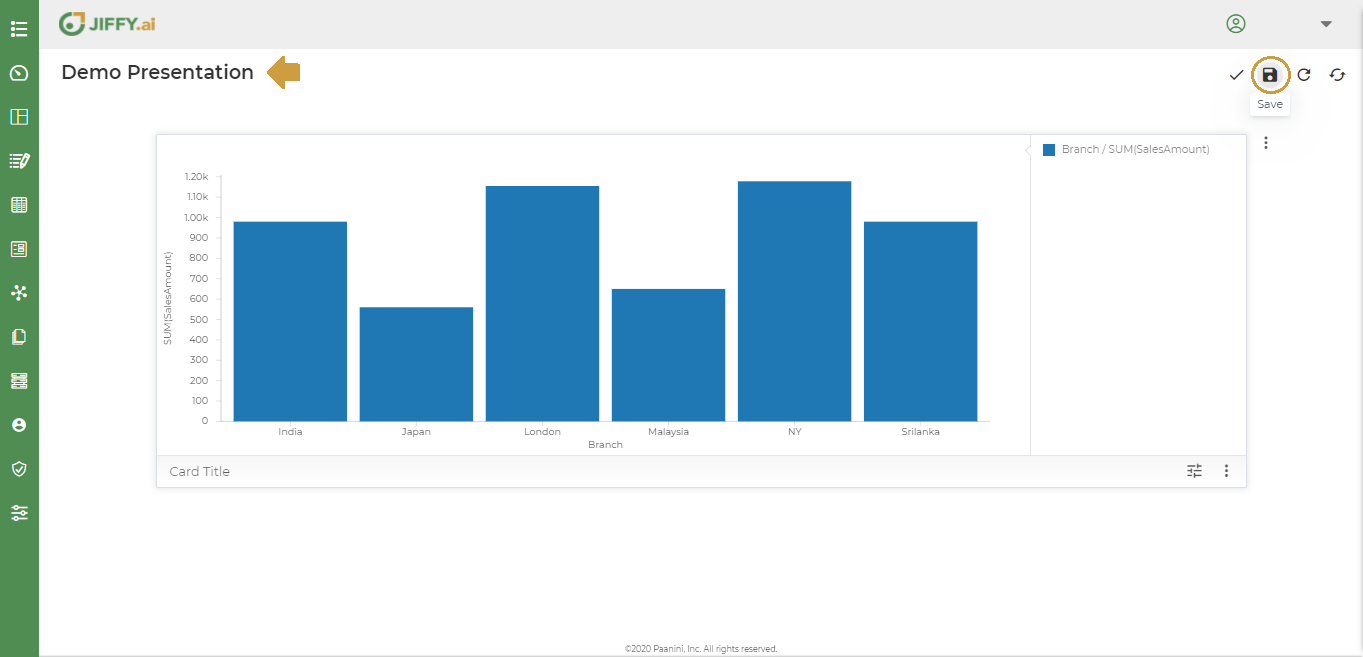
Let’s create a presentation to display the total sales across countries in each branch.
To plot the number of branches and the Total sales amount against each. X axis will have the branches and the Y axis we will Plot the Total Sales amounts for each branch
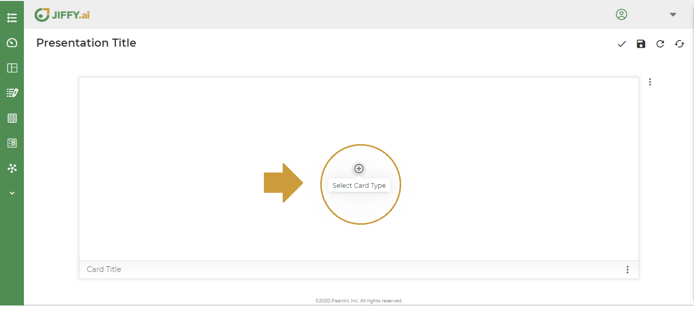
Click on + icon.
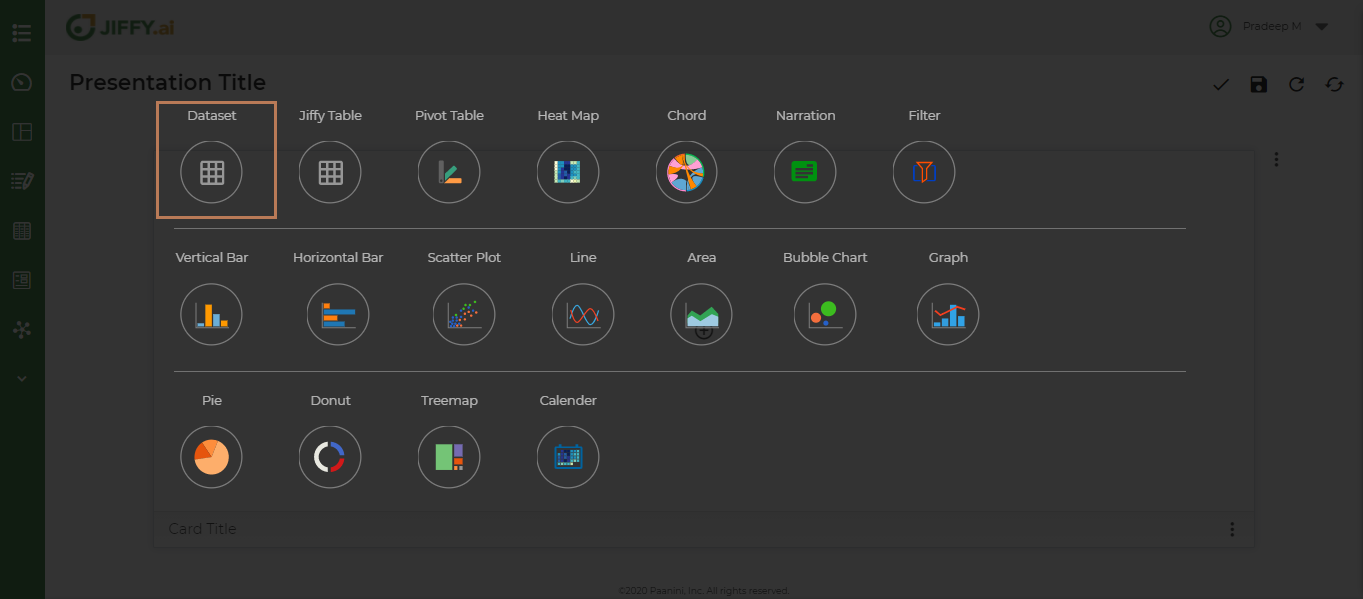
Click on + icon and Select Card Type.
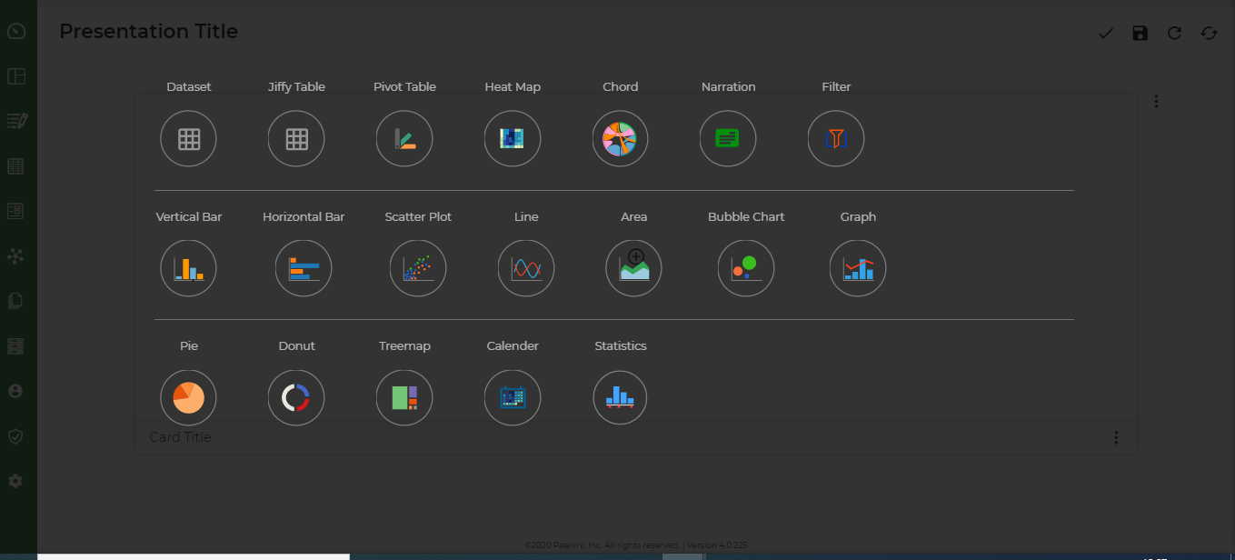
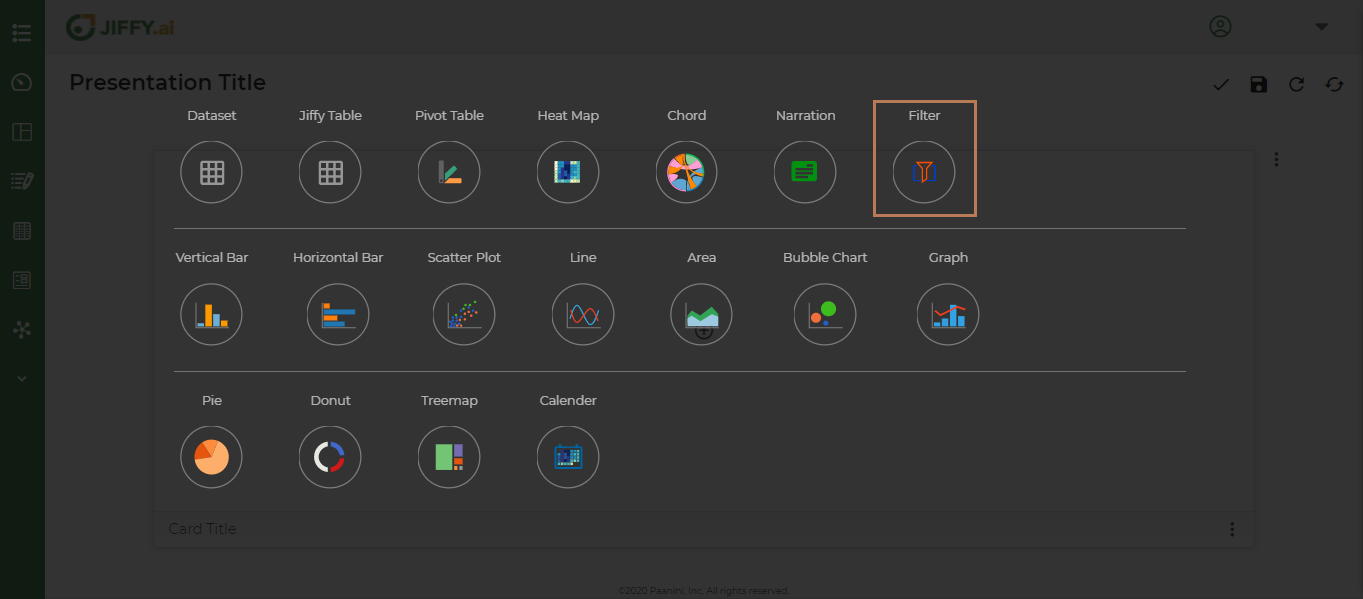
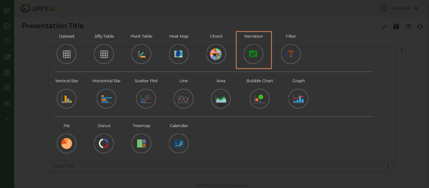
Below are various types of Presentation Cards that the user can utilize to create the Dashboards.
- Dataset - Tabular chart on any of the non Jiffy table datasets present in the App.
- Jiffy Table - Tabular chart on any of the Jiffy tables present in the App.
- Pivot Table - Pivot table chart using any of the datasets present in the App. A Pivot Table is used to summarise, sort, reorganise, group, count, total or average data stored in a table. It allows user to transform columns into rows and rows into columns. It allows grouping by any field (column), and using advanced calculations on them.
- Heat Map - A heat map is a graphical representation of data where values are depicted by color. Heat maps make it easy to visualize complex data and understand it at a glance.
- Chord - The chord diagram is a data visualization chart, used to visualize the relationship between various data attributes. It organizes data attributes radially in a circle and the between attributes is shown by drawing arcs between them.
- Narration – A story or message chart with a data snapshot depicting the message.
- Filter - Filter to isolate data values from a large dataset, based on one or more conditions. Apply on the Presentations, to generates a vies based on the filter condition.
- Vertical Bar – A vertical bar graph that visually displays data using vertical bars going up from the bottom, whose lengths are proportional to quantities they represent. It can be used when one axis cannot have a numerical scale.
- Horizontal Bar – A horizontal bar graph represent the data horizontally. It is a graph whose bars are drawn horizontally. The data categories are shown on the vertical axis and the data values are shown on the horizontal axis. The length of each bar is equal to the value corresponding the data category and all bars go across from left to right.
- Scatter Plot - A scatter plot uses dots to represent values for two different numeric variables. The position of each dot on the horizontal and vertical axis indicates values for an individual data point. Scatter plots are used to observe relationships between variables.
- Line - A Line graph uses lines to connect individual data points that display quantitative values over a specified time interval. Line graphs use data point “markers” that are connected by straight lines to aid in visualization. Line graph can be quite helpful in depicting the changes in values over time.
- Area - Area Graphs are Line Graphs but with the area below the line filled in with a certain colour or texture.
- Bubble Chart - A bubble chart is a data visualization that displays multiple circles (bubbles) in a two-dimensional plot. It is a generalization of the scatter plot, replacing the dots with bubbles. Most commonly, a bubble chart displays the values of three numeric variables, where each observation’s data is shown by a circle (“bubble”), while the horizontal and vertical positions of the bubble show the values of two other variables.
- Graph – A graph for pictorial representation or a diagram that represents the data
- Pie - A Pie Chart is a type of graph that displays data in a circular graph. The pieces of the graph are proportional to the fraction of the whole in each category. The entire “pie” represents 100 percent of a whole, while the pie “slices” represent portions of the whole.
- Donut : A Donut chart is a variant of the pie chart. While the two charts are quite similar in the way they look and function, the following features of the doughnut chart set them apart:
- The Donut chart has a cut out center.
- The center of the Donut chart can be used to render additional information like the total of all data values as well as the data value of the slice being hovered upon. In this case, then, rendering data labels and data values separately is not required.
- TreeMap - A treemap chart is used for representing hierarchical data in a tree-like structure. Data, organized as branches and sub-branches, is represented using rectangles, the dimensions and plot colours of which are calculated w.r.t the quantitative variables associated with each rectangle , each rectangle represents two numerical values.
- Calendar - A calendar chart is a visualization used to show activity over the course of a long span of time, such as months or years. They’re best used when you want to illustrate how some quantity varies depending on the day of the week, or how it trends over time.
- Statistics - A statistics chart is defined as the pictorial representation of statistical data in graphical form. The statistical graphs are used to represent a set of data to make it easier to understand and interpret statistical information.
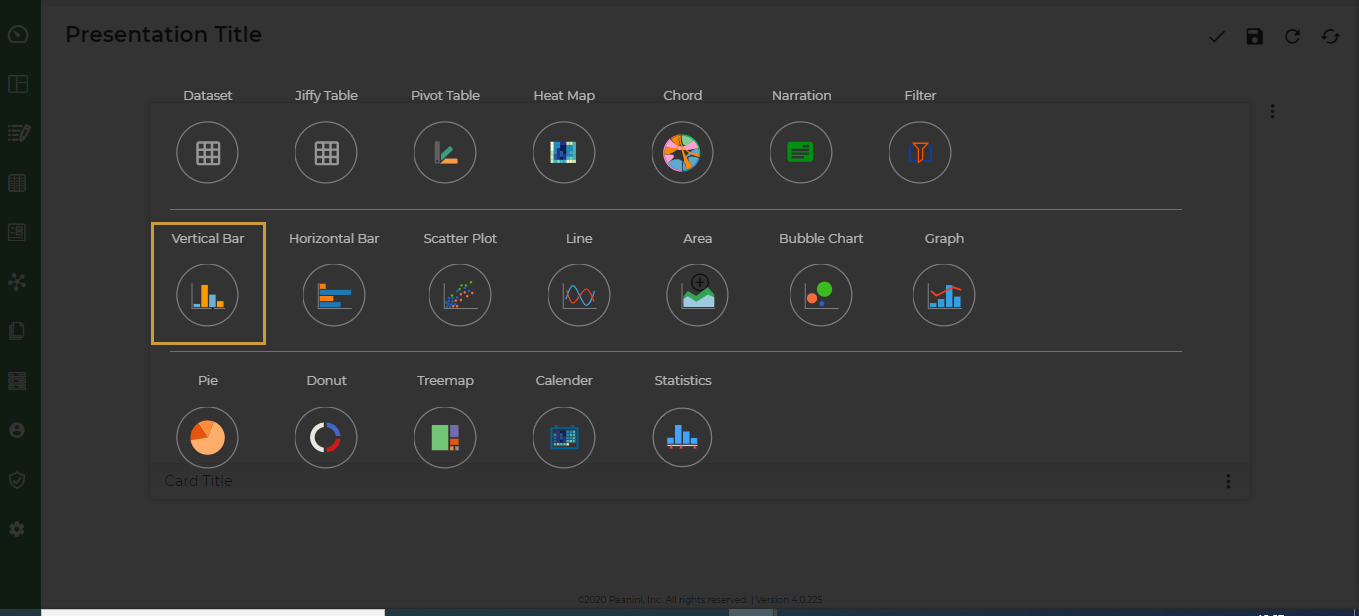
Select a Vertical Bar chart.
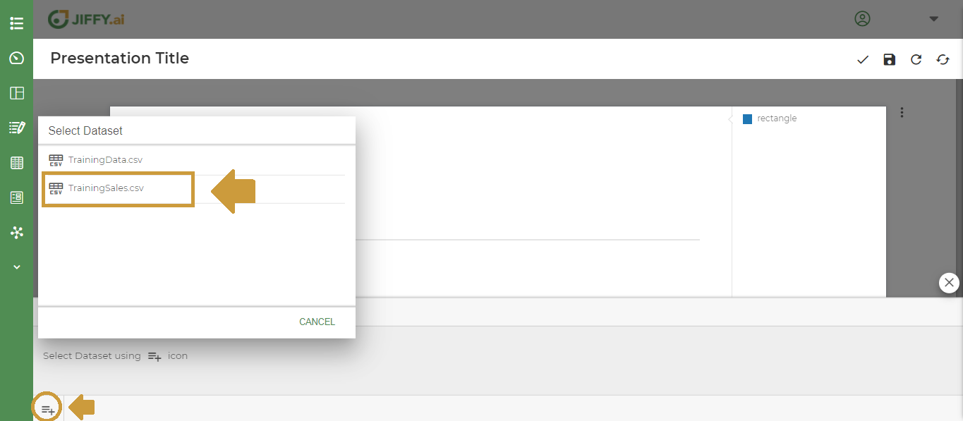
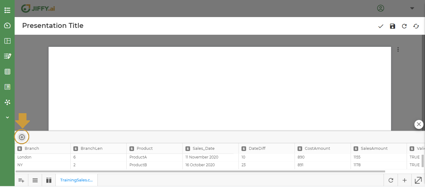
To plot the graph, a Dataset is required.
Click on + icon. It lists all the Datasets available for this app.
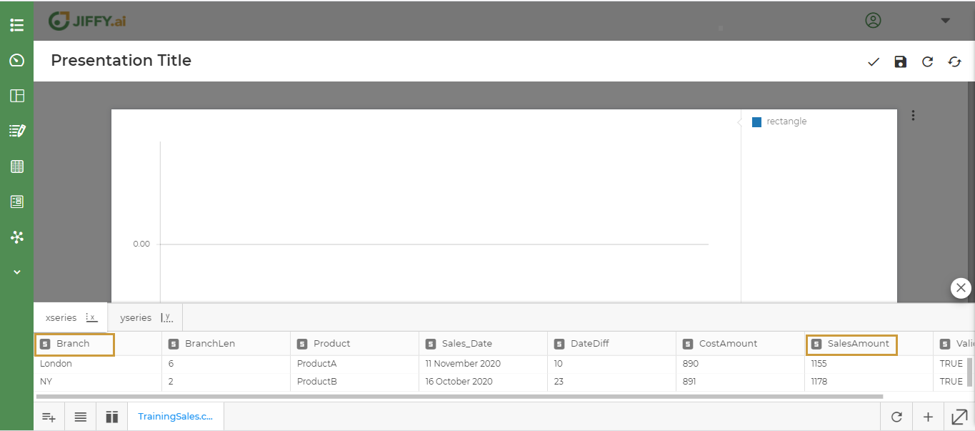
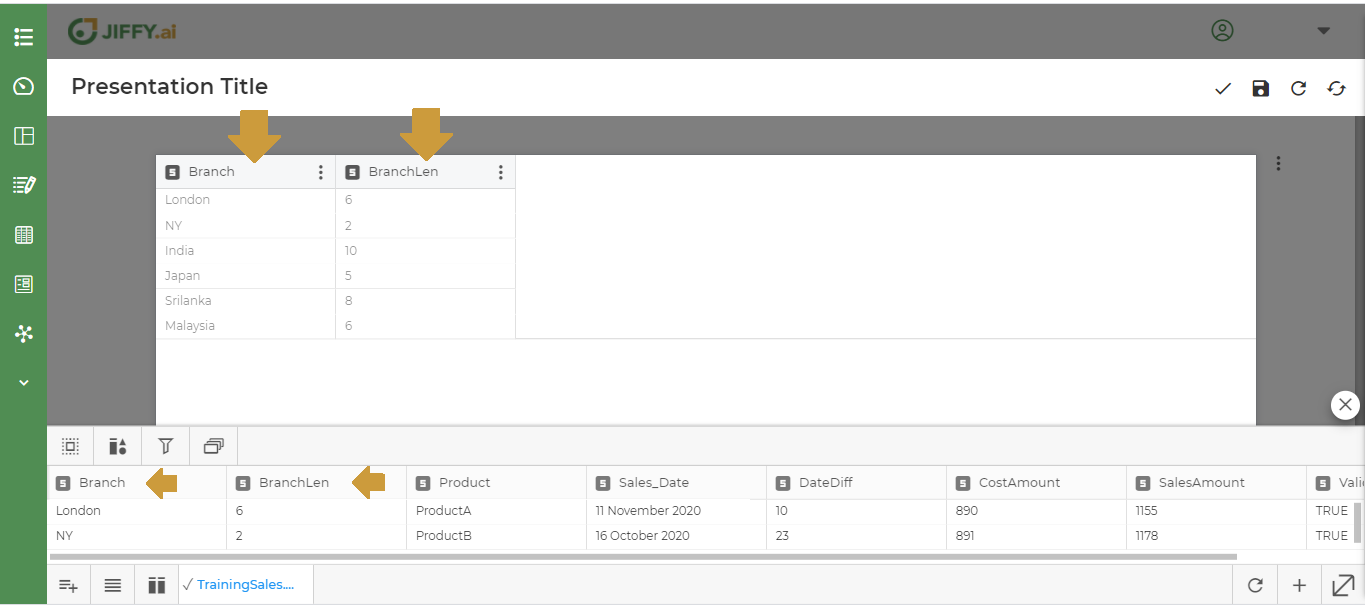
Select the Dataset and plot the fields as shown below. (For this example select the “TrainingSales” Dataset)
Select Branch for the x-axis and SalesAmount for the y-axis
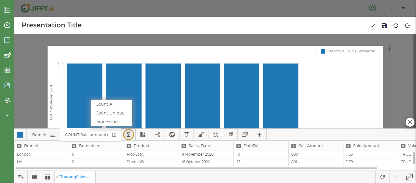
Click on ∑ icon to write own expression.
Read about Customize Charts to know more.
Choose expression and write SUM(SalesAmount).
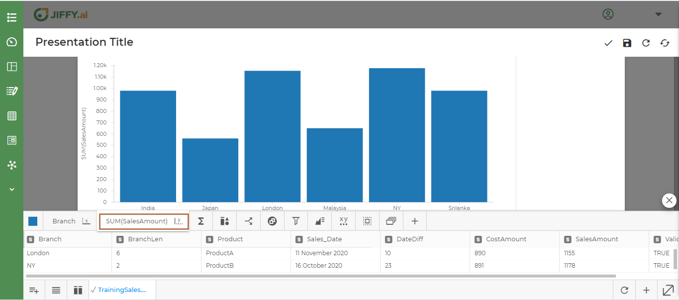
Above graph shows the total sales across countries in each branch. With Branch on the X axis and Count of Sales Amount on the Y axis.
Save the presentation
Give a valid title for the presentation and Click on Save icon.
Other Type of Charts
Let’s create few more charts from the dashboard
Dataset
Click on + icon and Select Card Type. Refer Step 2 from the above section..
Select Dataset chart as shown below
Choose the Dataset to plot the graph. Refer to Step 4 from the above section.
Click on the + icon, to add all the fields from the dataset.
Double-click the fields you want to add from the dataset, one by one.
Below is the Dataset Chart.
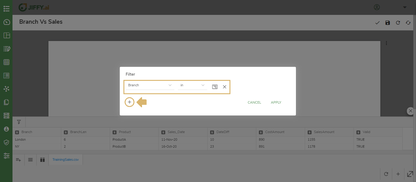
Filter
Click on + icon and Select Card Type. Refer to Step 2 from the above section.
Select Filter chart as shown below
Choose the Dataset to plot the graph. Refer to Step 4 from the above section.
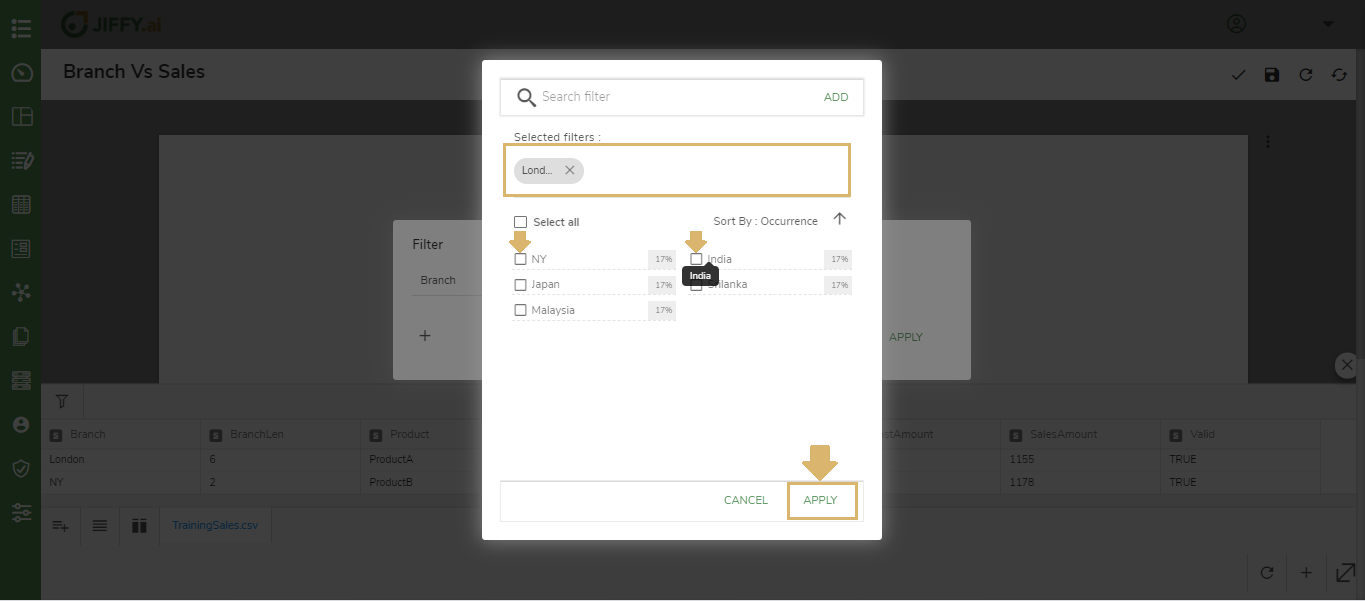
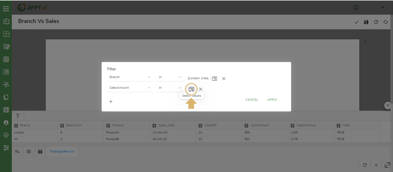
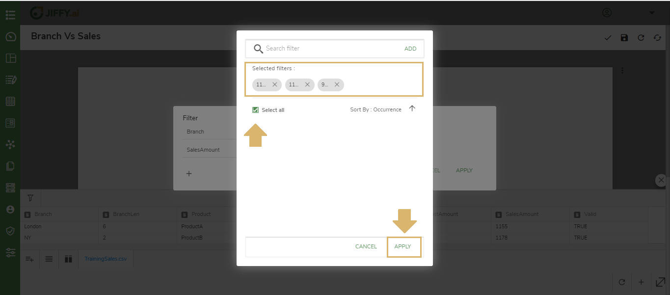
Select the different fields of the dataset to add to filter card.
Click on the + icon and the fields
After adding all the required fields, Click on the Apply button
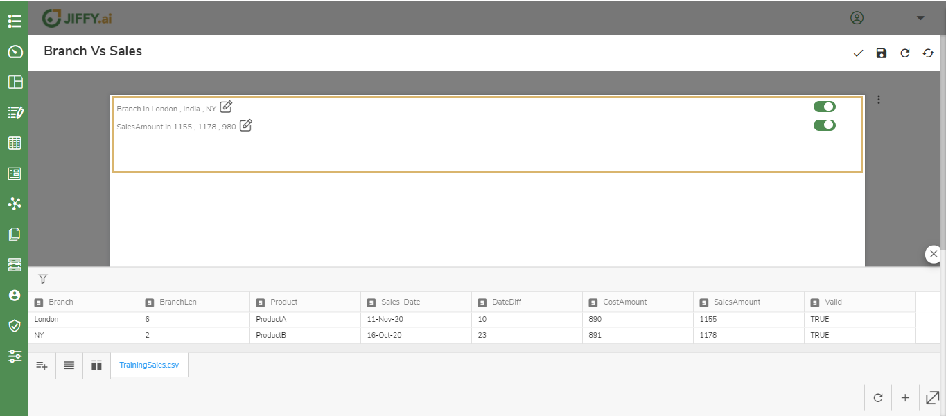
The Filter card is now ready for the fields you created with the filter.
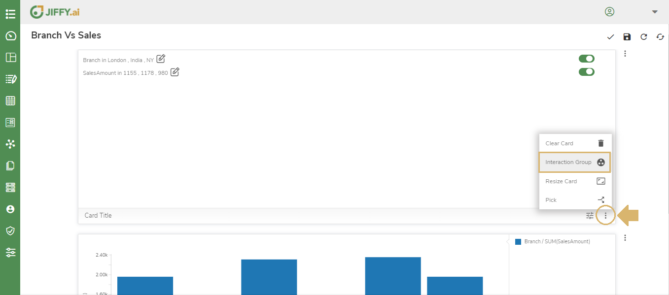
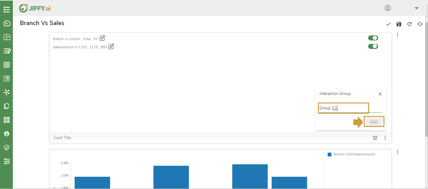
Create an Interaction Group to see if the filter reflect across one or multiple charts in the presentation. Refer to Interaction Group in customize presentation to know more.
Click on the More Button(Vertical 3 dots) in the card and select Interaction Group.
Enter a name for Interaction Group say “Group G1” and click on ADD.
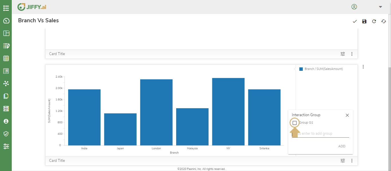
Click the More Button(Vertical 3 dots) in the Vertical Bar Chart and Select the Interaction Group “Group G1”.
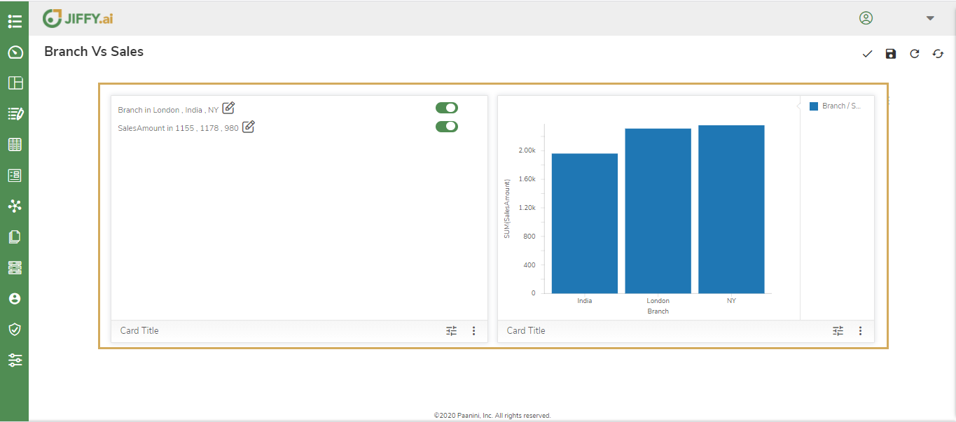
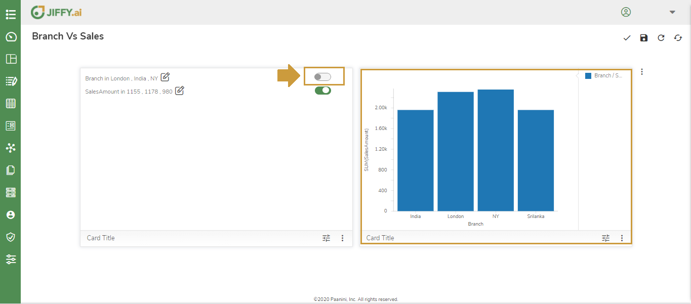
Now both the charts are ready for interaction.
Now, In the Filter chart toggle the data to see if it reflects in the Vertical Bar Chart simultaneously.
This way user can create interaction groups between multiple charts on the presentation to create a visual filter reflected across all the charts in the dashboard.
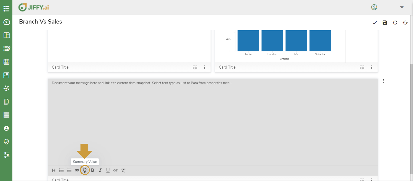
Narration
This card is used display the summary values in you presentation
Click on + icon and Select Card Type. Refer to Step 2 from the above section.
Select Narration chart as shown below
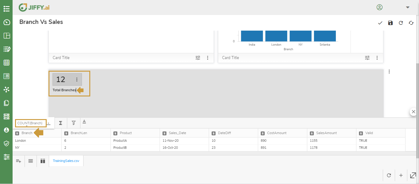
Select the Summary Value option to select the field to summarise on
Type in a description and Select Branch column, it automatically Counts the branches and display the Count
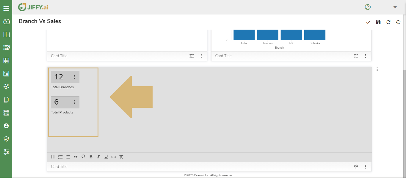
Repeat the above steps for the different fields to summarize on