
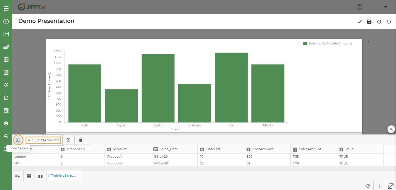
Customize Charts
Last Updated: Nov 16, 2020
Last Updated: Nov 16, 2020
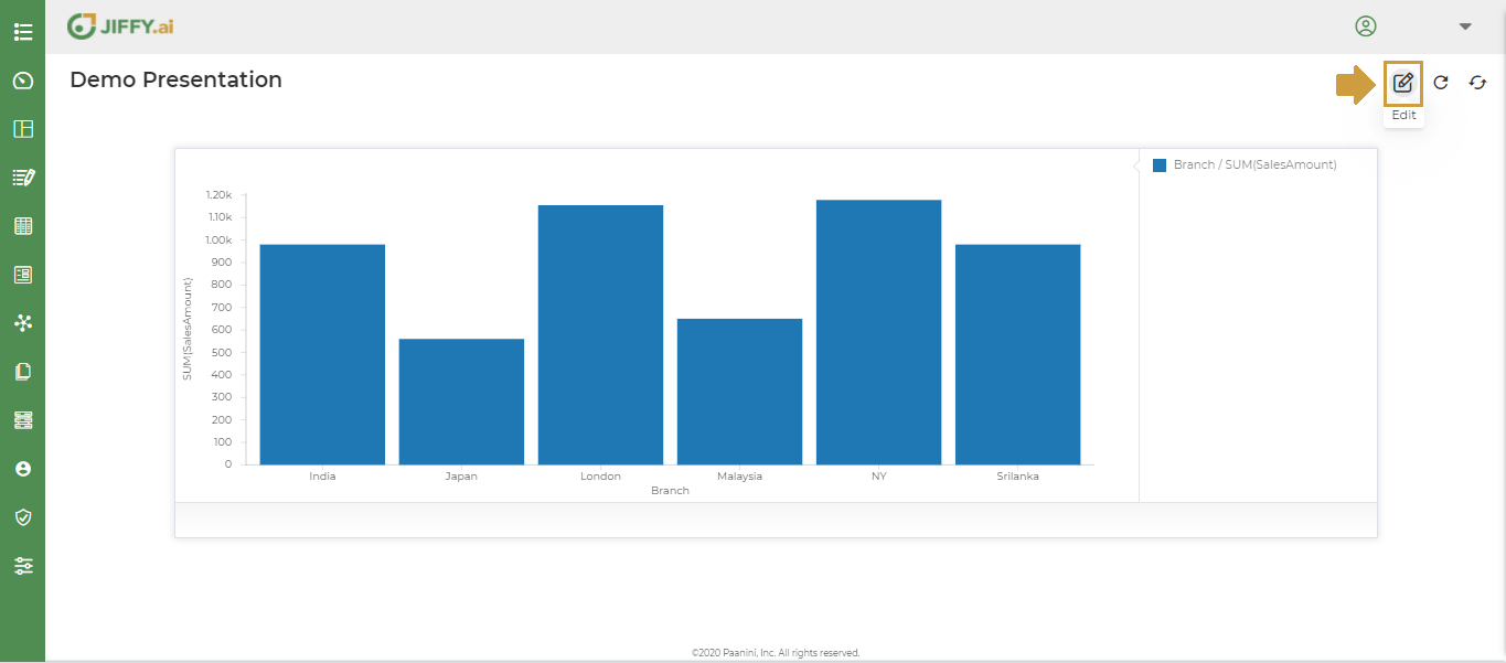
To create a visually appealing presentation, use Chart properties to customise the charts.
Click on Edit button.
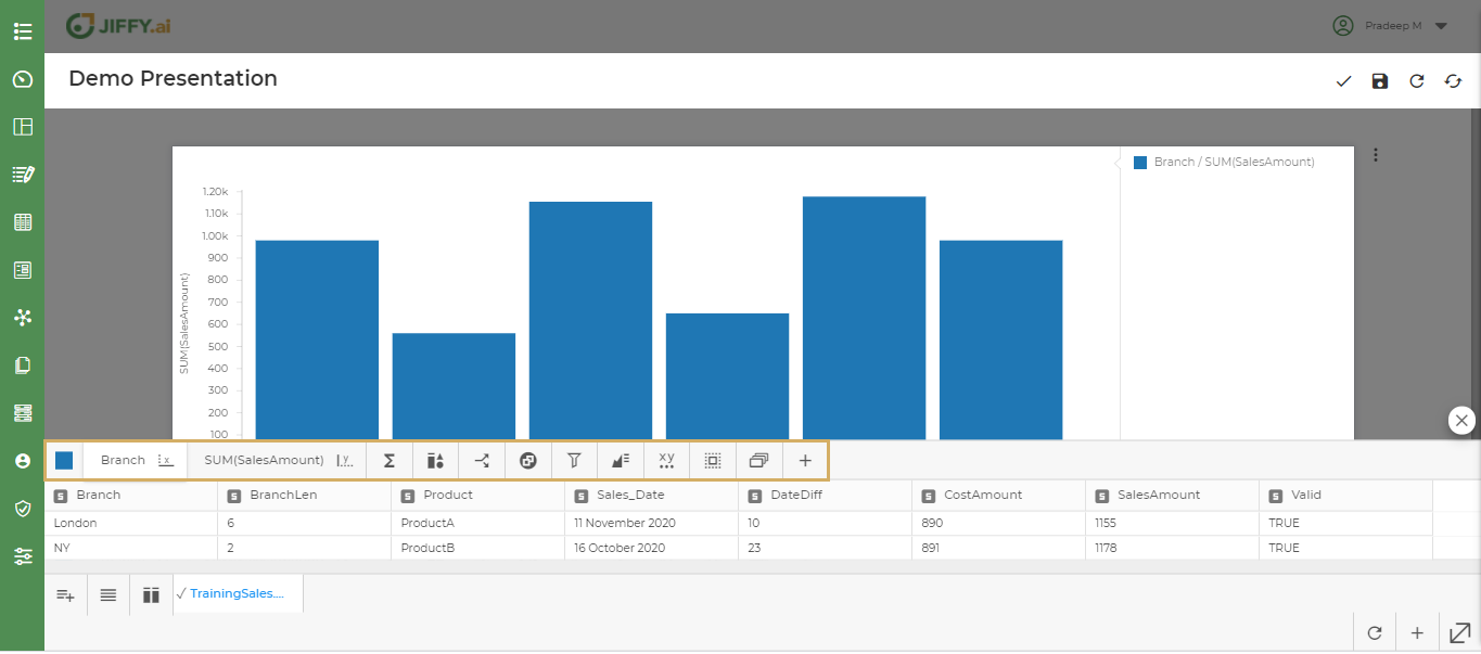
Click on Chart properties to edit the chart.

User can change the colours to enhance the data displayed in the chart.
Click on Change Colour icon.
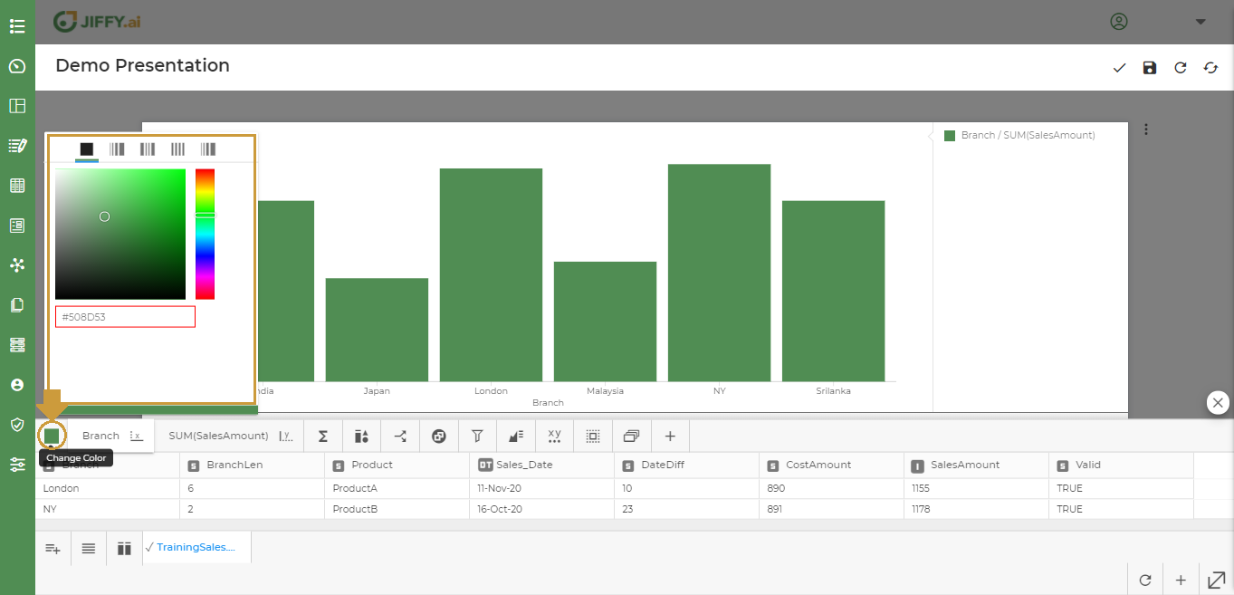
There are different ways to use the colours in the chart.
There are many functions that can be applied to various data types, such as integer, string, date time, etc. These functions change according to the data type of selected columns.
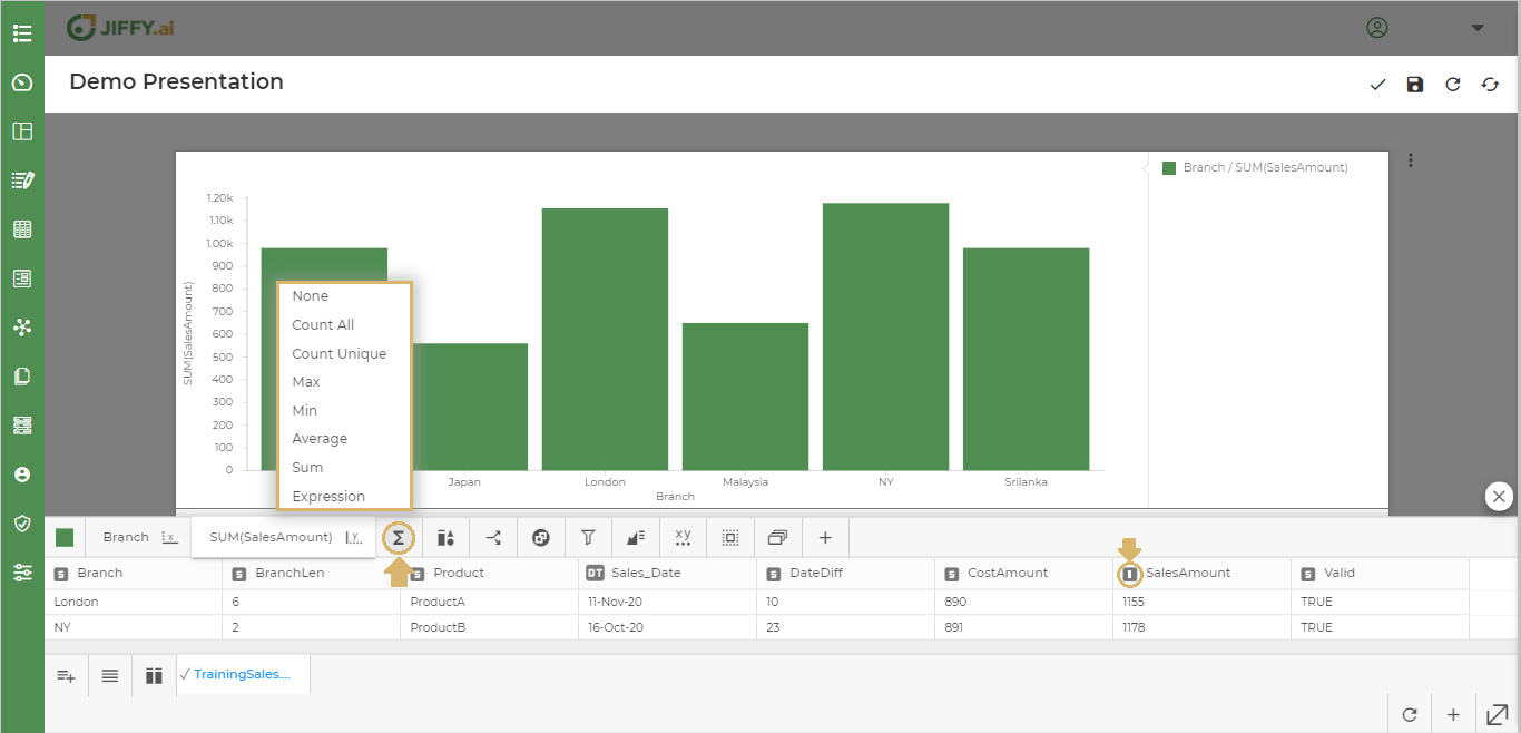
If the data type is “String,” i.e., “S,” then functions such as Count All, Count Unique, and Expression are available.
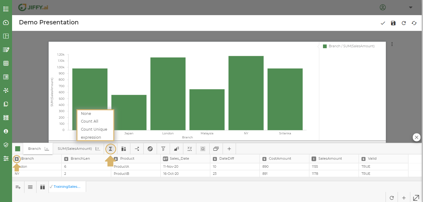
If the data type is an “Integer” i.e., “I” then functions such as Count All, Count Unique, Max, Min, Average, Sum and Expression are available.
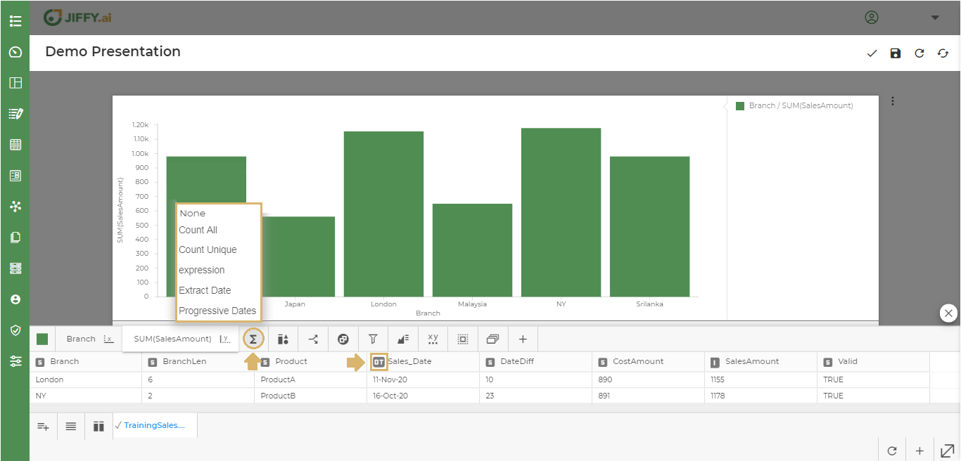
If the data type is a “DateTimestamp” i.e., “DT” then functions such as Count All, Count Unique, Expression, Extract Date and Progressive Dates are available.
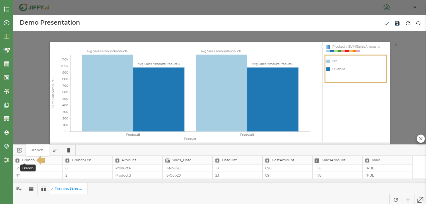
Component Legend allows the user to select the display of multiple components used in the chart.
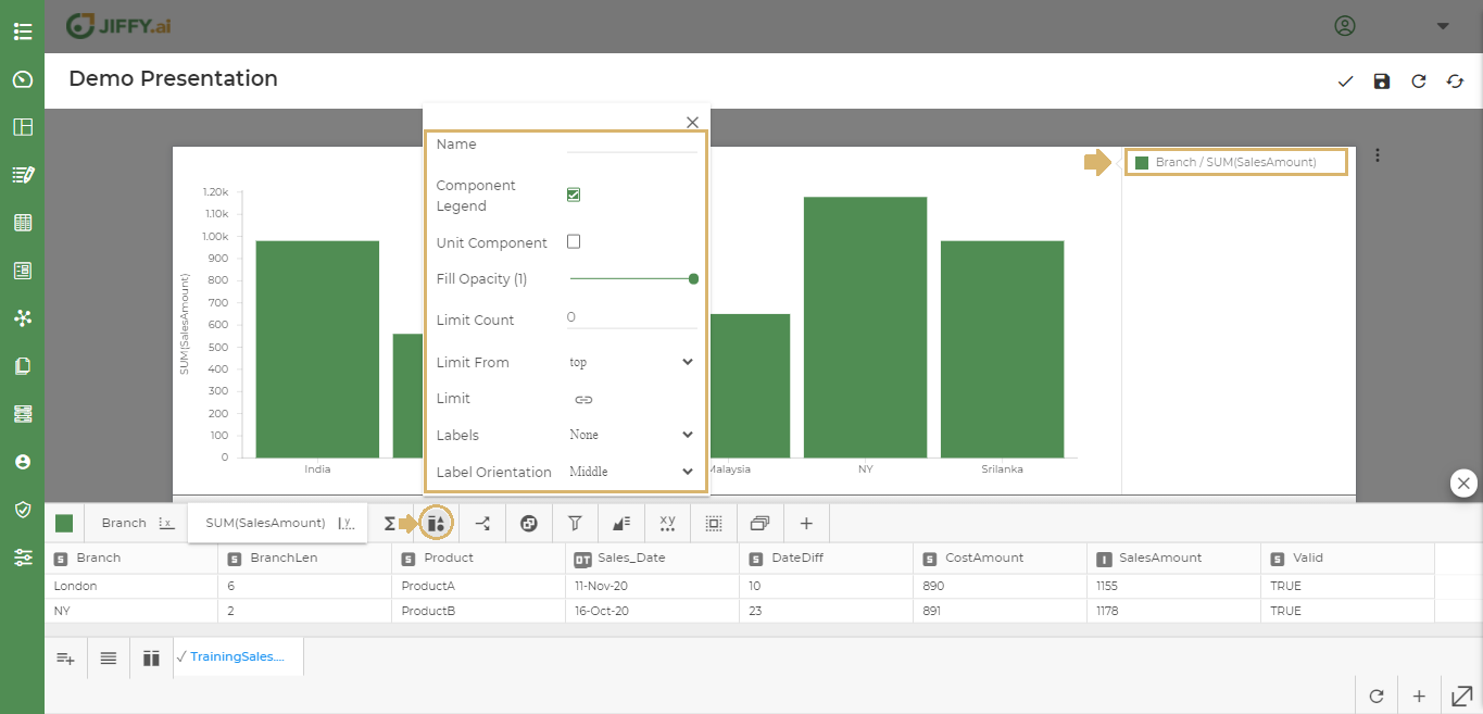
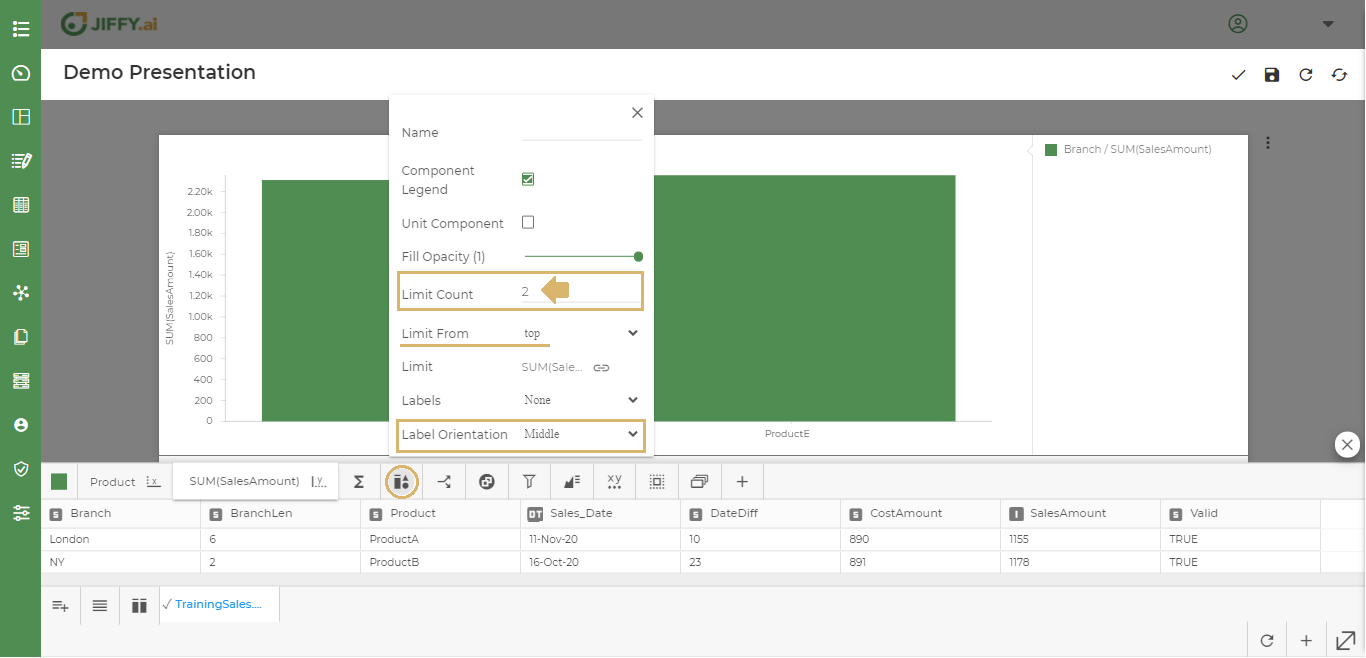
There can be large quantities of categorical values in the chart when plotting data. In order to limit the top or bottom values, user can set the limits by Limit Series option.
Click on the link icon in the Limit attribute.
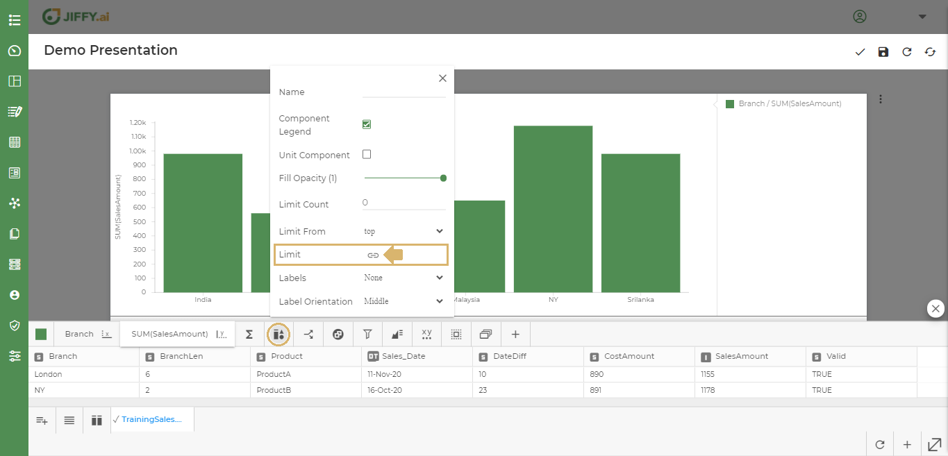
Select the column to set the limit. Ex: SalesAmount - by default SUM function is selected.
Set the Limit Count to 2 to see the top 2 products with highest sales.
Change the Limit From Top to Bottom to get the lowest sales of 2 products. Ex. - Only Product B and Product E has the highest sales.
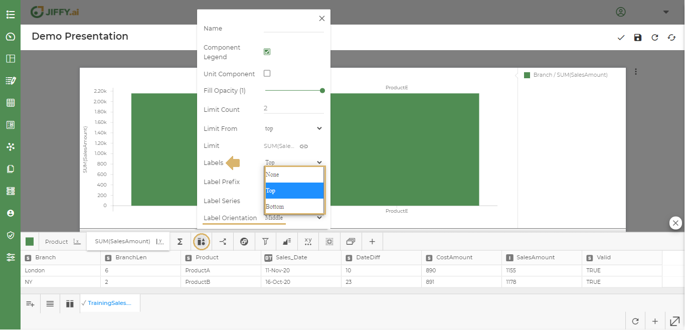
With this option, users can choose how and where the labels should appear in the chart.
Set the Labels to either on Top or Bottom
Set the Label Series to either the X or Y axis names.
Set the Label Orientation either to Middle, Left or Right.
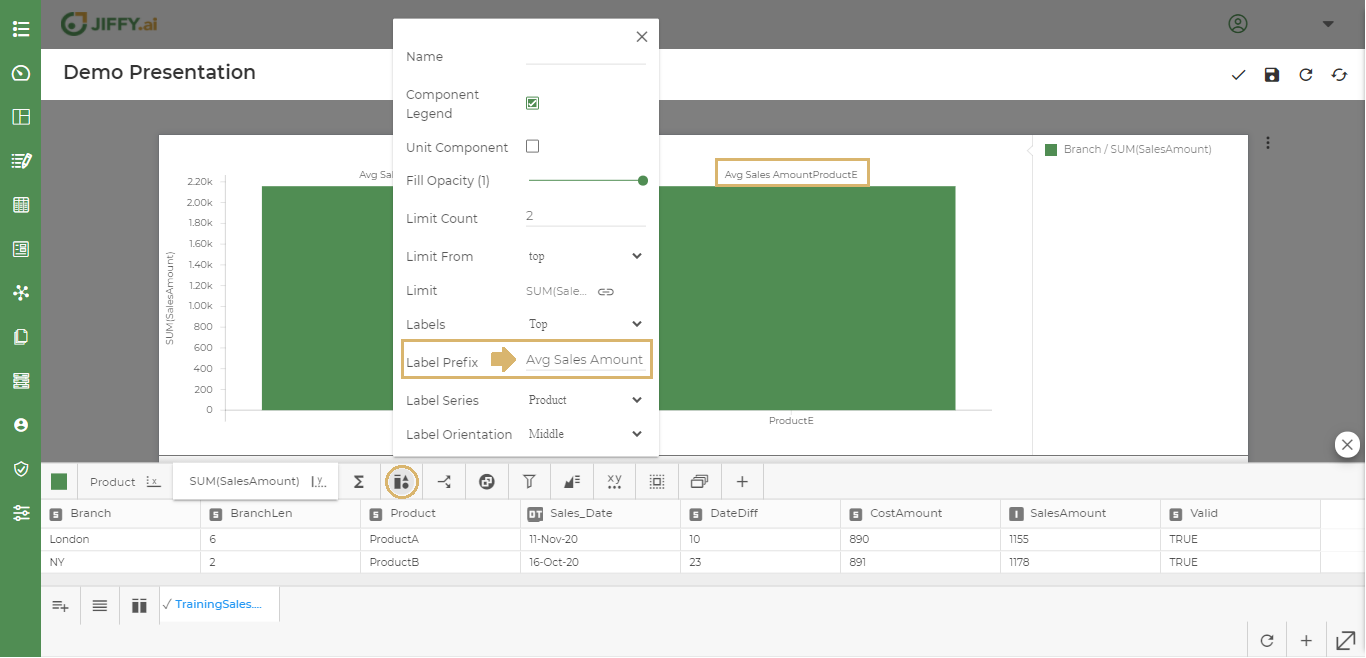
The Label Prefix can be changed. Which appears before the selected label series. Ex. - Avg Sales Amount.
Select Split By option, to split the presentation data.
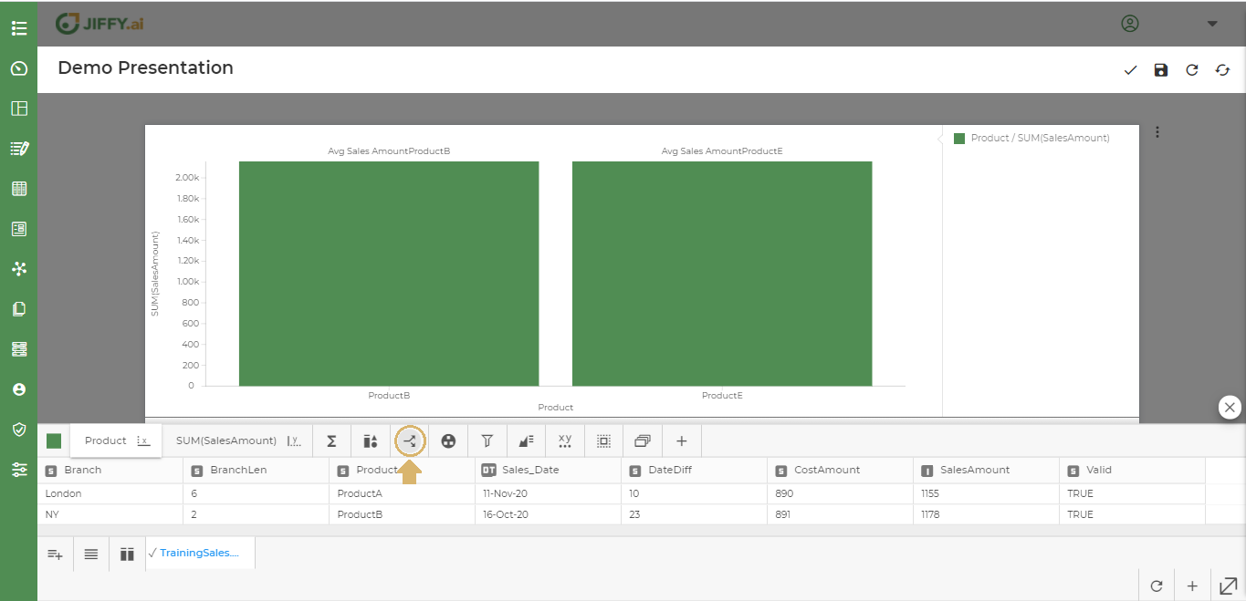
The following screen appears, from this the user can select the field by which field he wants to split the data. Ex. - Branch.
In the below example, the Data is Split based on Product field.
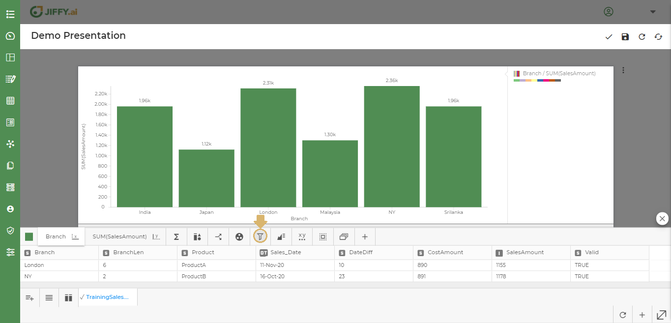
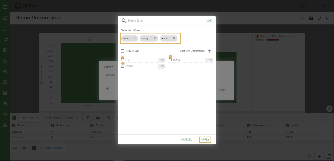
User can filter the charts by adding certain filter conditions and make changes to the display.
Ex: To see the data of only “NY”, ”Japan” and “India” and not any other country.
Click on Filter icon
Select the column to filter and give the condition, E.g.: Branch, ‘not in’
Click on + icon to select values.
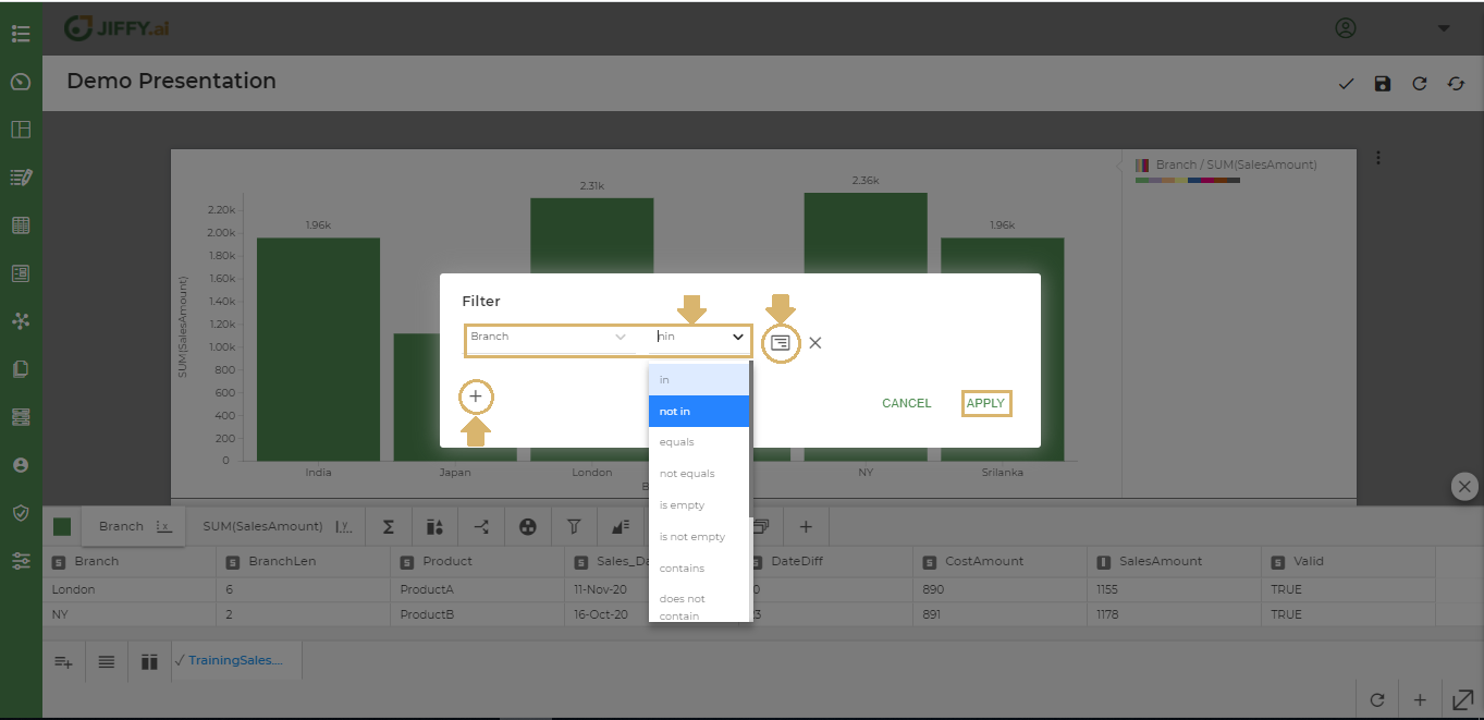
Select the branch to apply filter on , E.g.: London, Srilanka, Malaysia and click on Apply
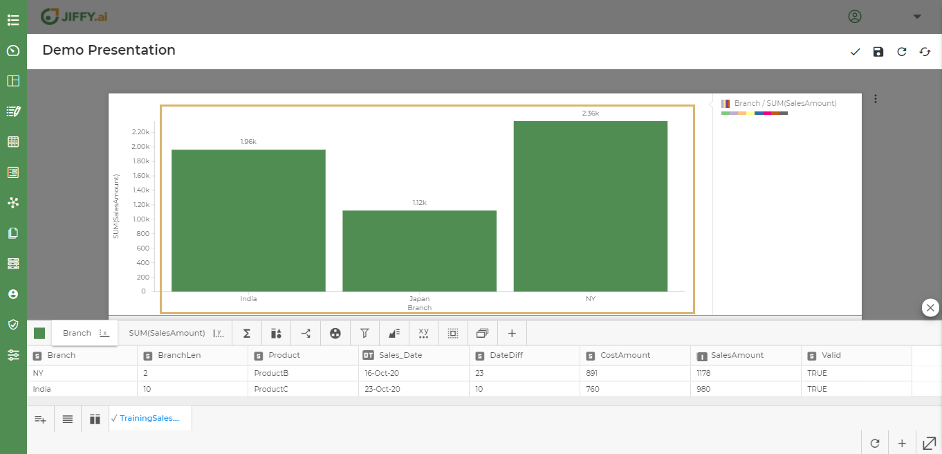
In the below example, The chart displays only India, Japan and NY data.
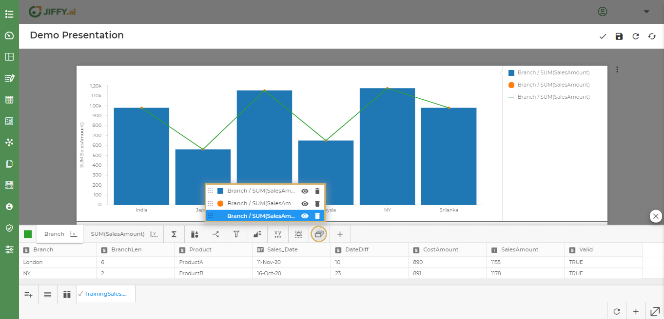
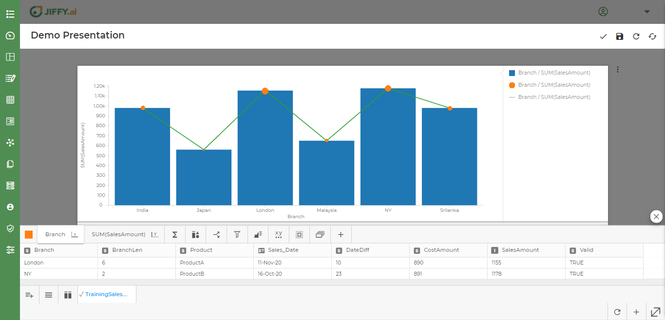
User can add additional components on the existing chart to show more visual effects.
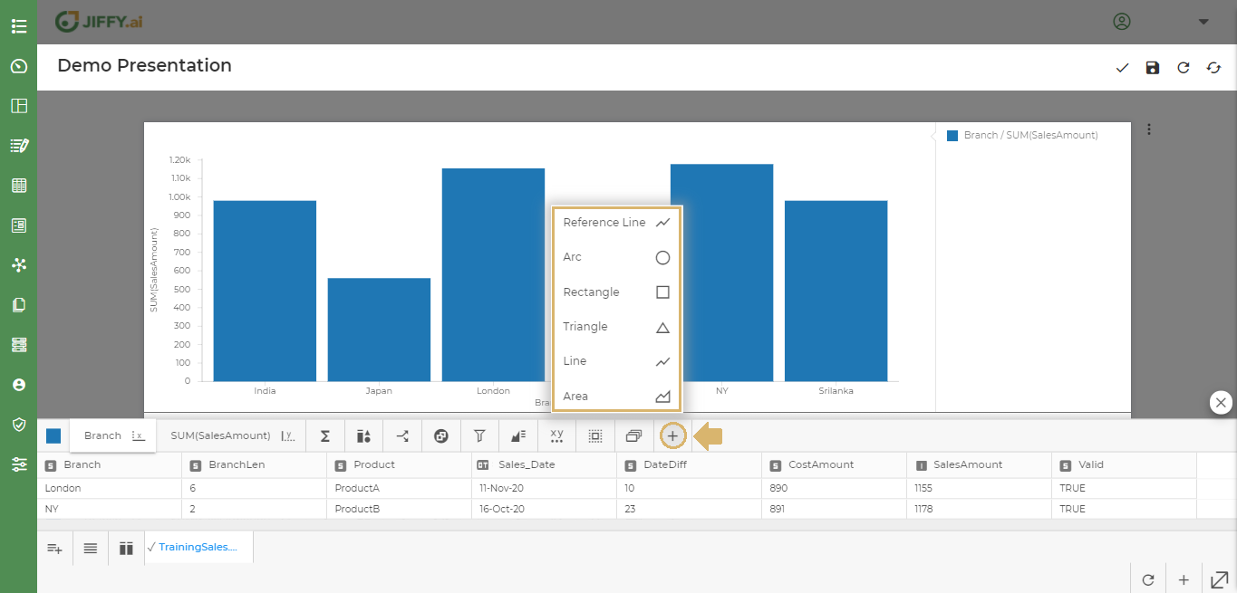
E.g.: The line and bubble on a Vertical chart. Size of each bubble indicates the profits for each product.
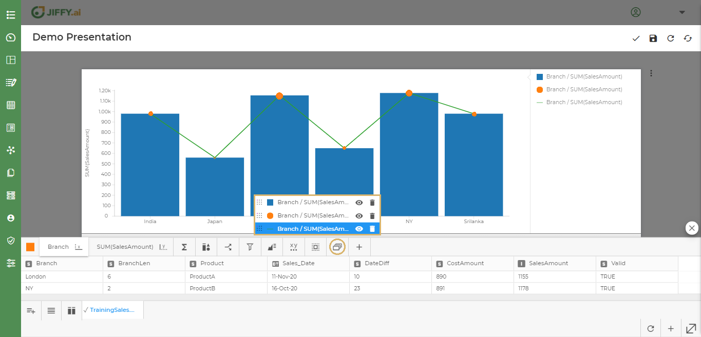
To change any particular property of the component, select the component from the Component List.
E.g.: Select either the bar, line or bubble component accordingly.
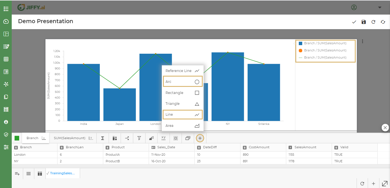
To change size of the bubble, Select the bubble component.
Click on the link icon.
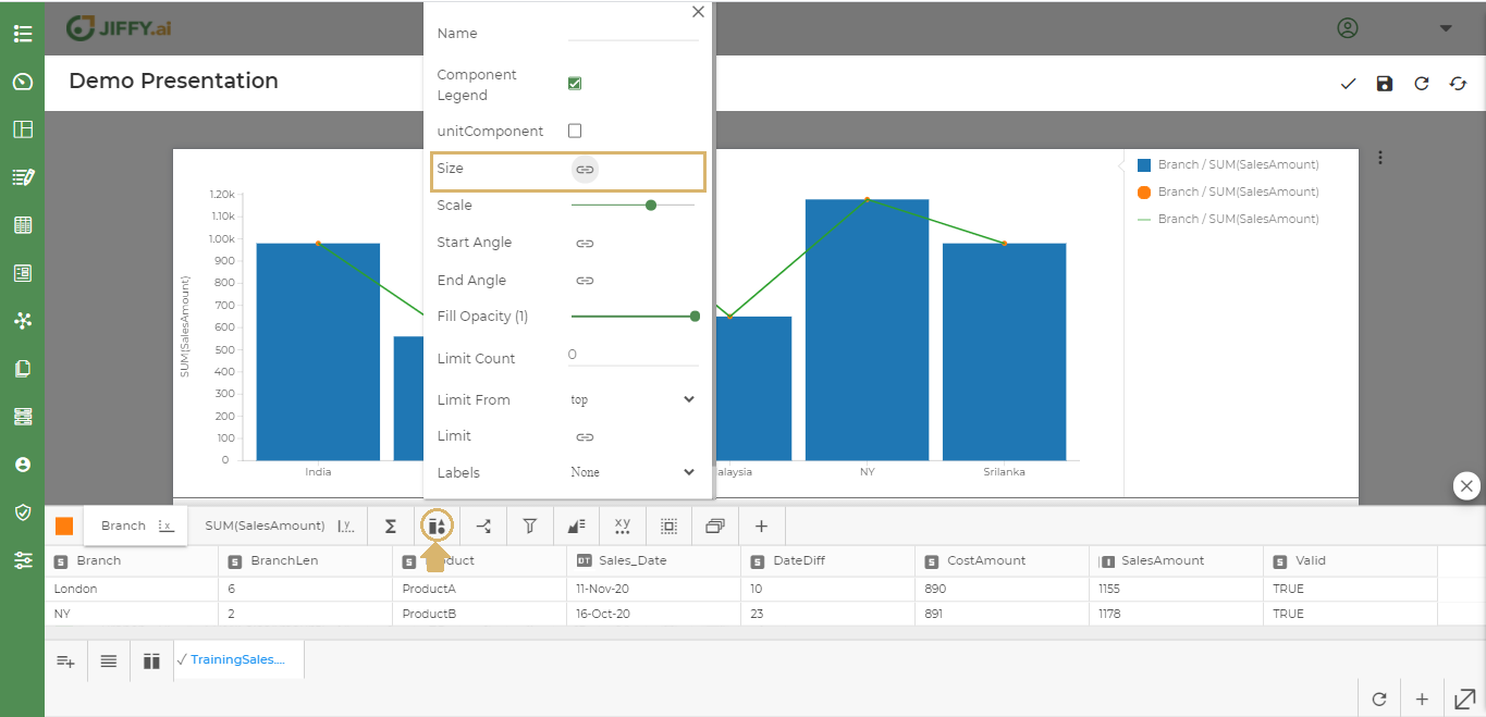
Ex. - Select SalesAmount as the size of the bubble to be shown. The bubble sizes varies as per the profit in each branch.
To change the stroke width in the line chart, select the line chart.
To change the stroke width, select and drag Stroke Width.
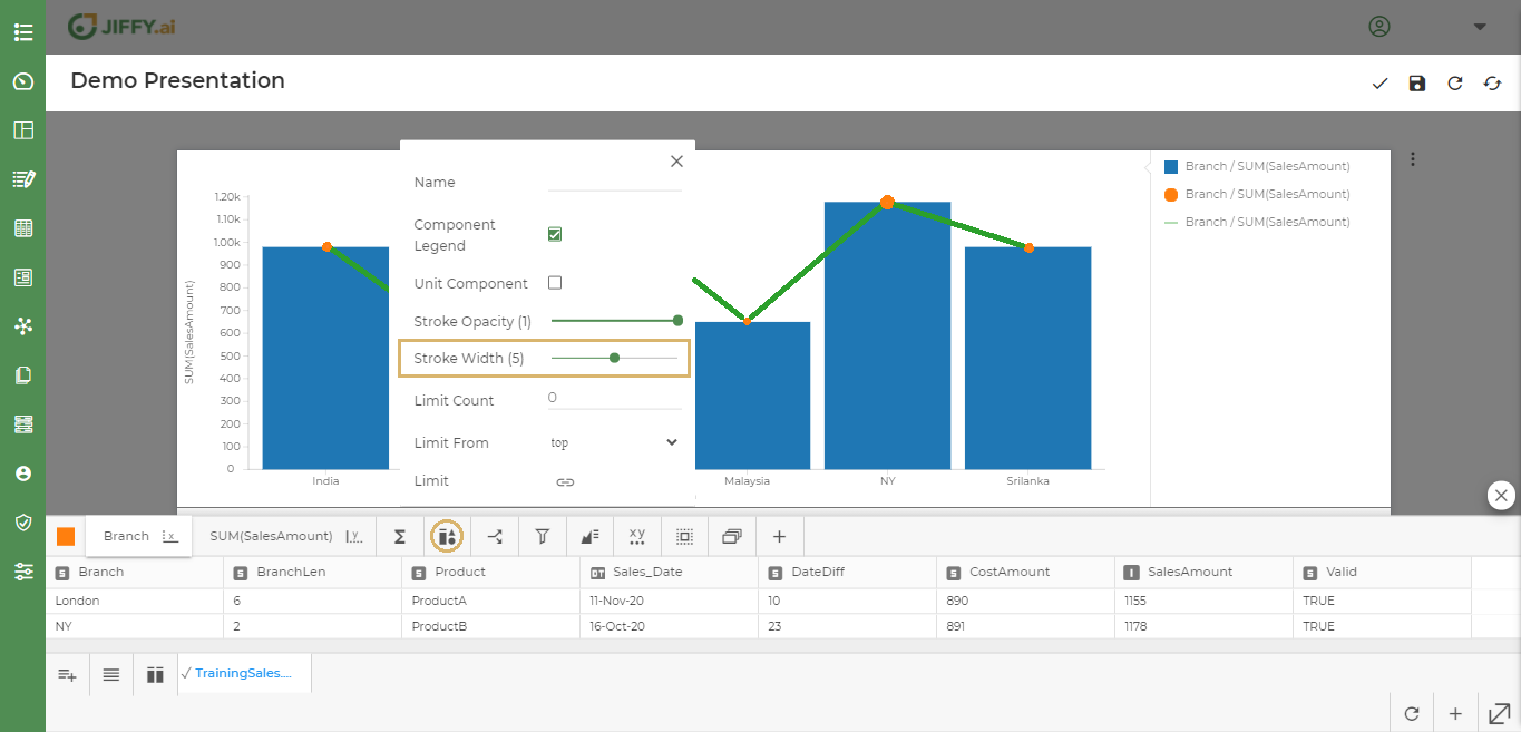
Similarly user can change the other properties of these components according to the need.
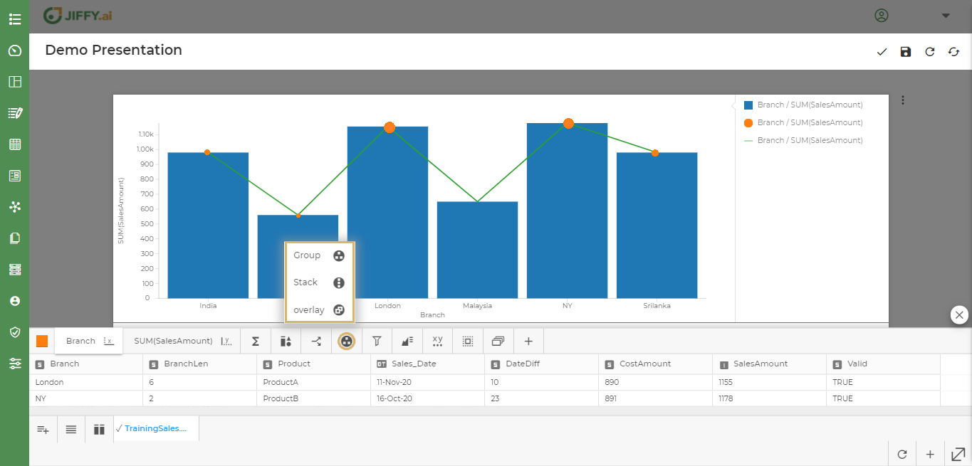
User can change the way components are arranged in the graph. Ex. - Stacked on top of each other, grouped together, or overlayed.
Select Visualization Attributes as shown below and select the type.
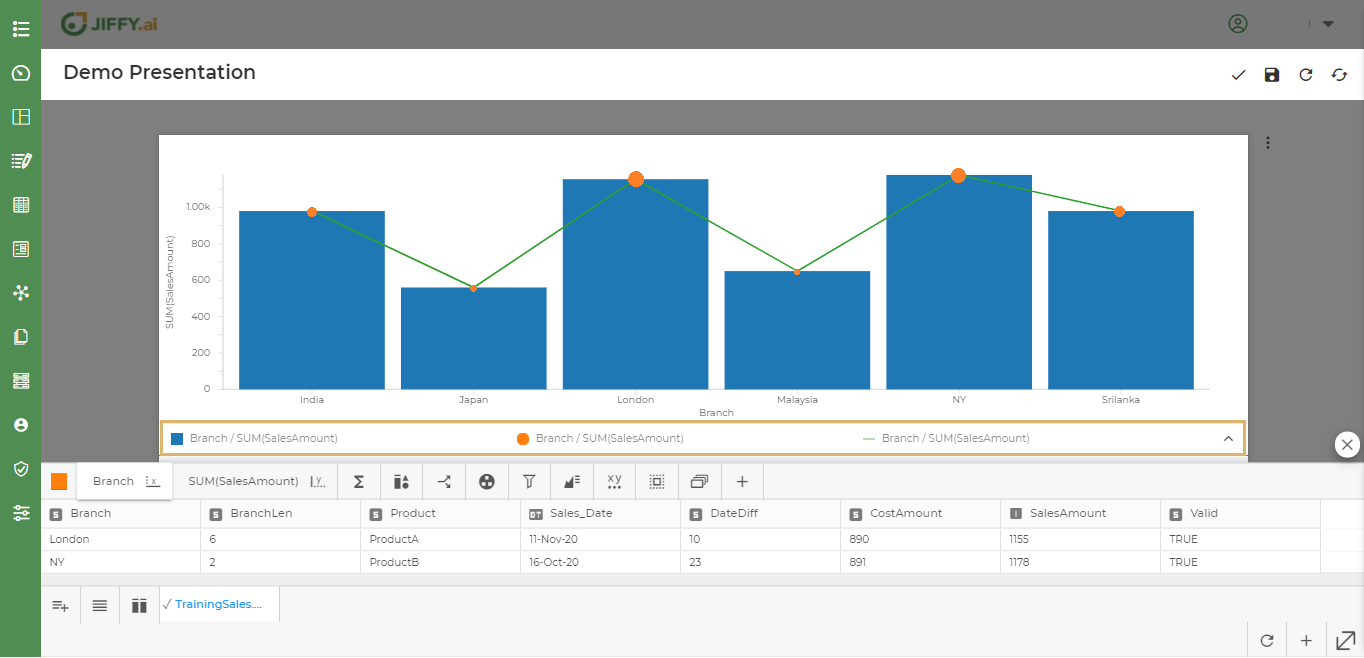
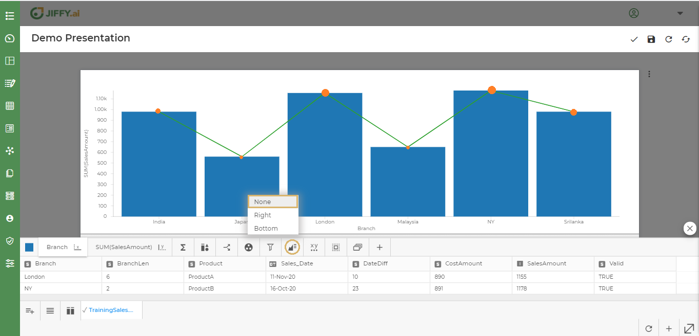
User can change the position of legend display to Right or Bottom.
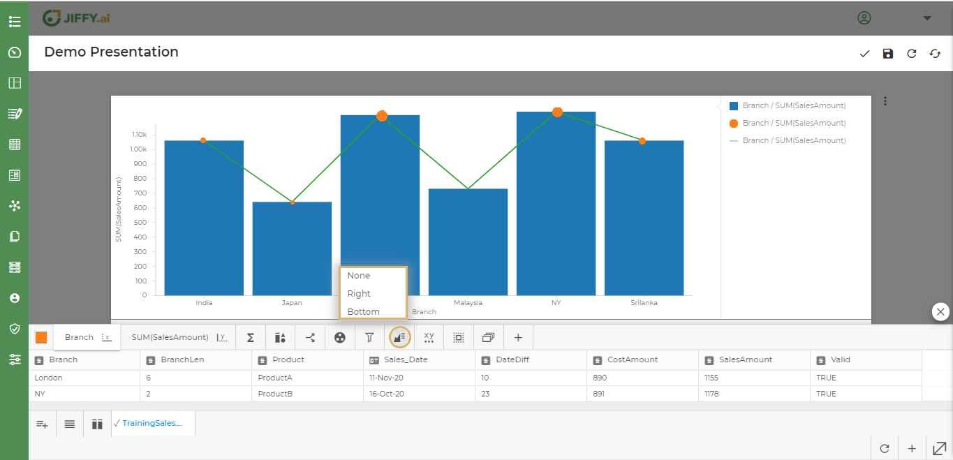
Note: Legend position is set to Right by default.
Select Bottom to set legend at the bottom.
Select None, if the legend is not required.
User can change the margin of the axes by using General Properties.
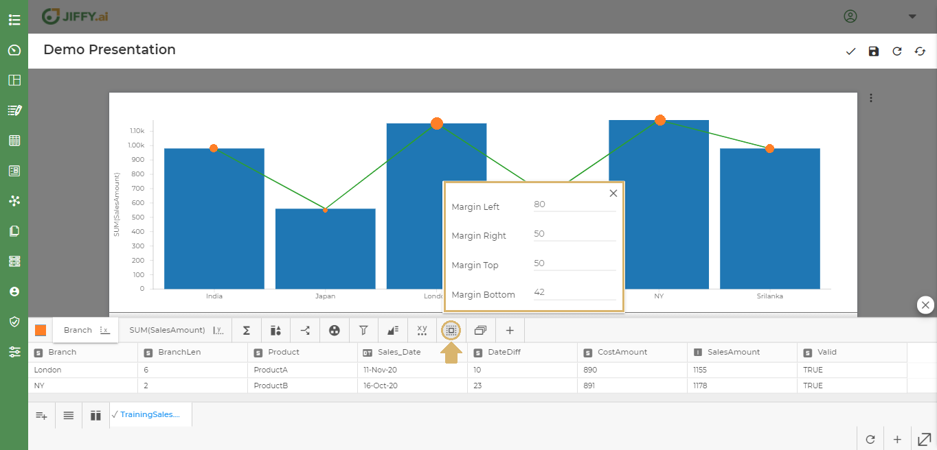
An axis shows data points that lie within a range of values. For each axis, user can specify the range, scale, and many other properties.
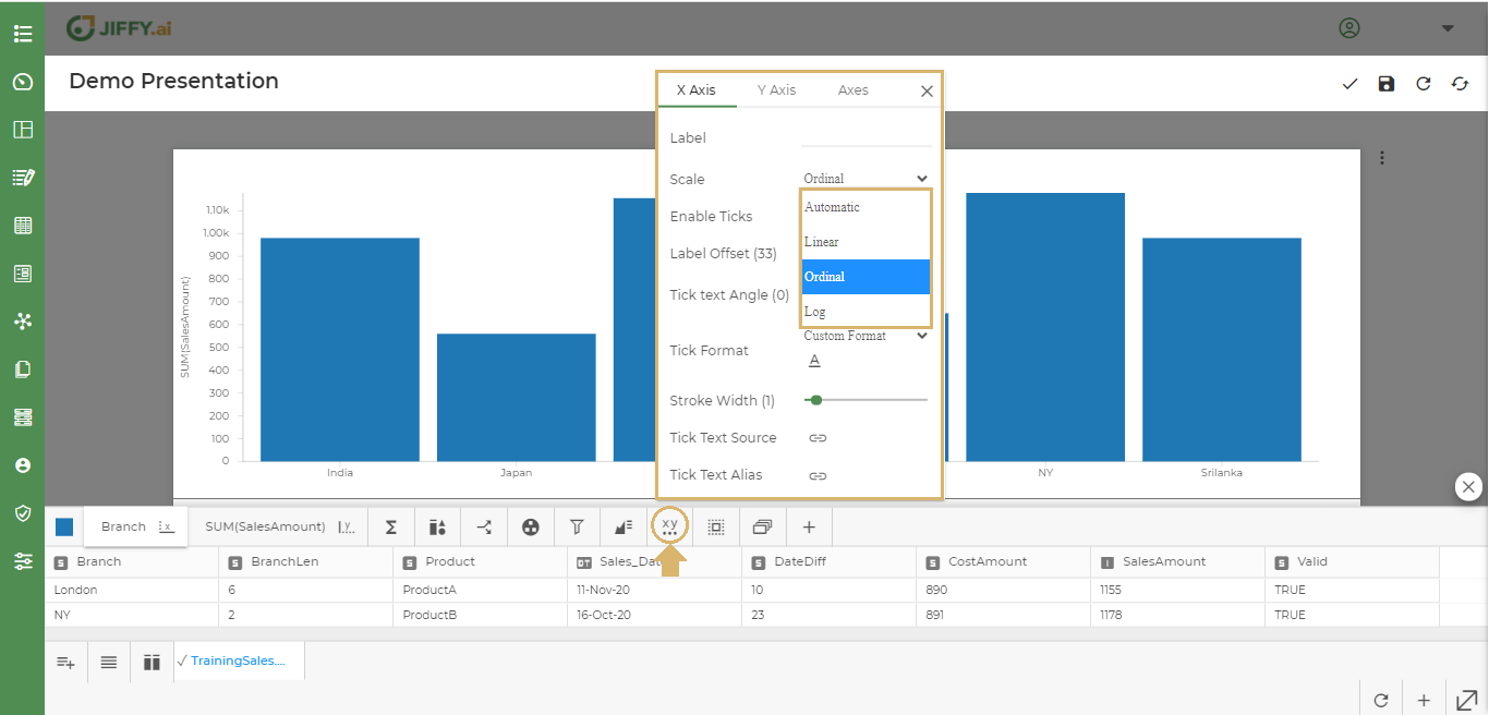
Click on Axis Properties.
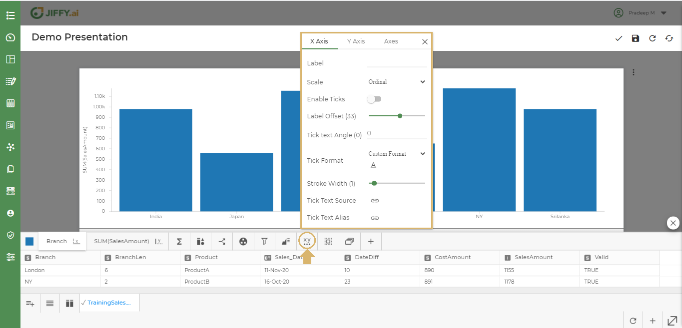
Axis Properties such as
User can change the scale of the Axis to Automatic, Linear, Ordinal or Log types.
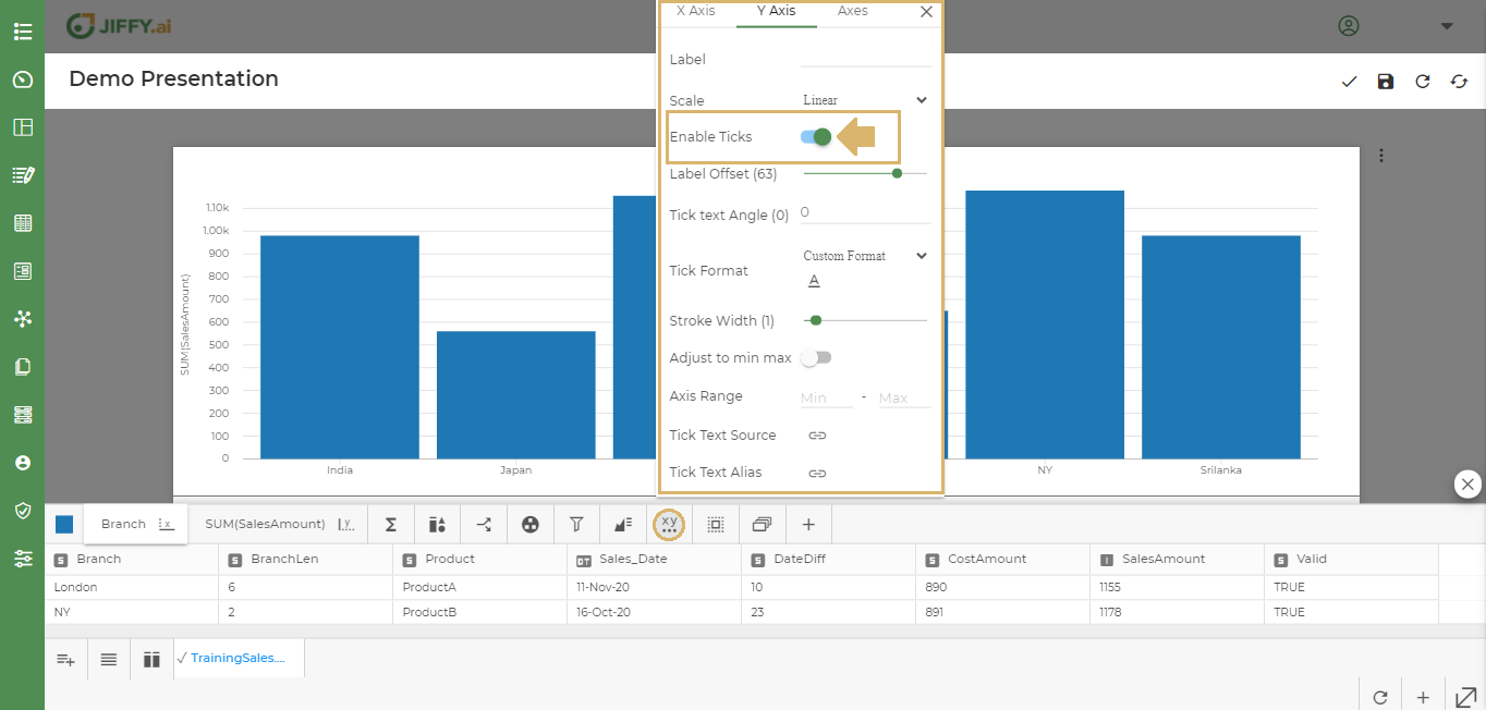
User can enable ticks to show the lines in X and Y axis.
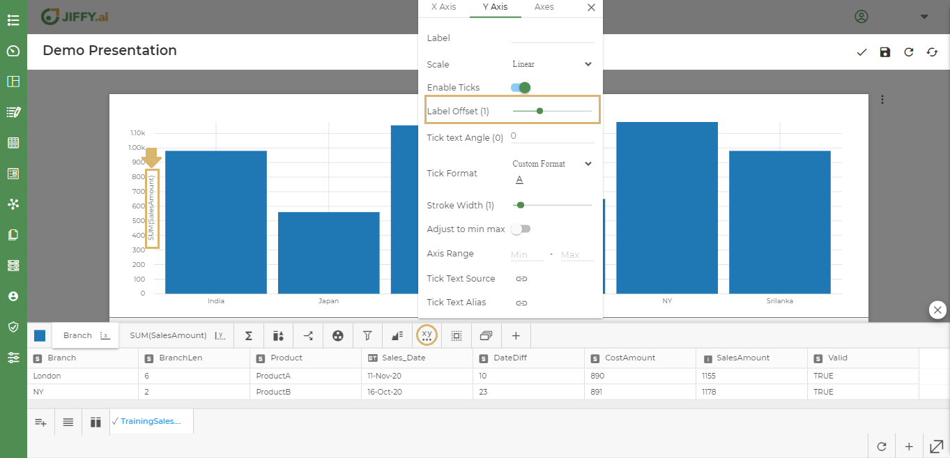
User can change the Labels positions in the chart.
In the below example, y-axis SalesAmount position has been set to “1”, So it appear near the chart.
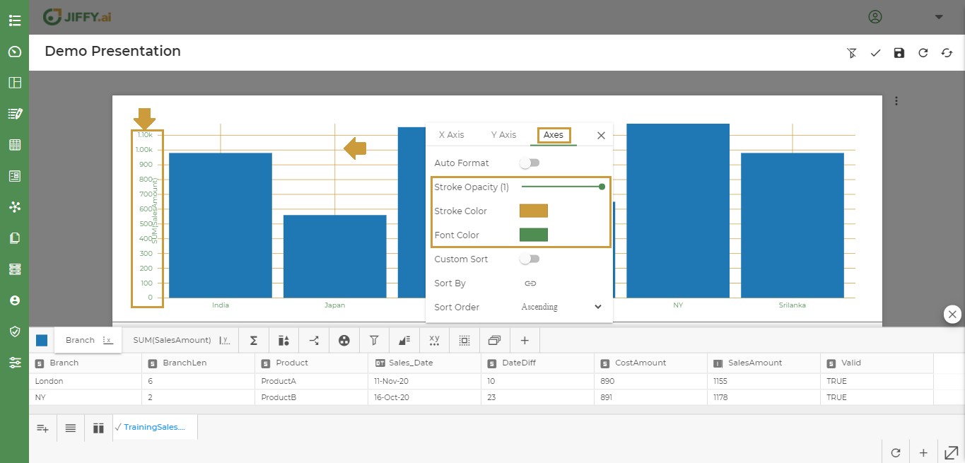
User can change the X and Y axes Stroke Colour, Stroke Opacity, Font Colour as shown below.
User can change the Tick Text Angle by giving a number.
Ex: X-Axis Branch names are now tilted to 45 degrees.

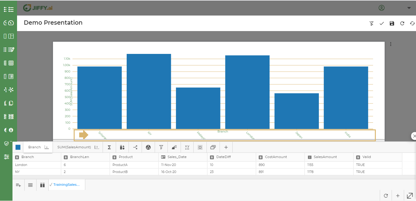
In Custom Sort user can give his own values. Ex: To view the X-Axis in different Branch order like Srilanka, NY, Malaysia, London, Japan and India, change it using this property.
Provide the sort order values and click on ADD and Save
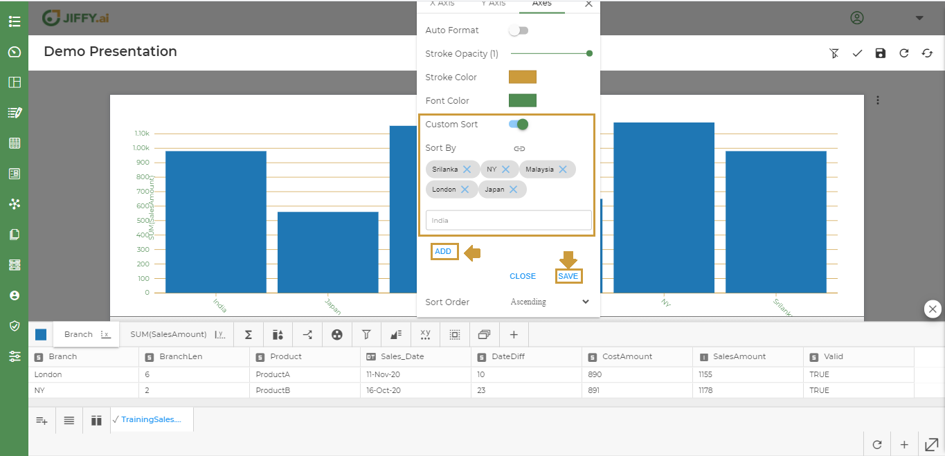
Now the values are changed as per the order.
By default Custom Sort is switched off. User can change the way the bars appear as per ascending or descending. Ex. - Branch as shown below:
Click on Sort by > Select Branch > Set Sort Order as Descending order
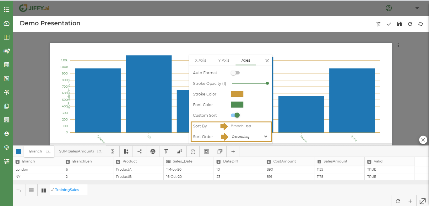
Now the chart showing the Branch in Descending Order.
User can change the Sort Order to Ascending or Descending as needed.