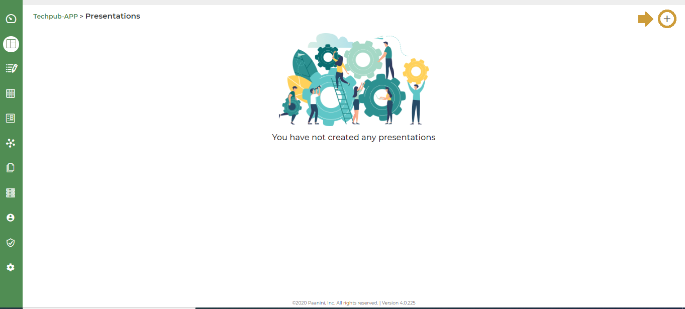
Create a Presentation to display Total Sales across the Branches.
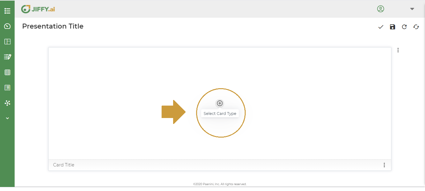
Following are the steps to create the Presentation.
- Click the + icon.
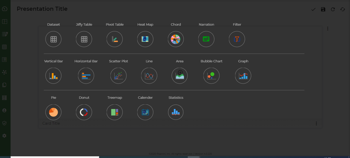
Click the + icon to Select Card Type.
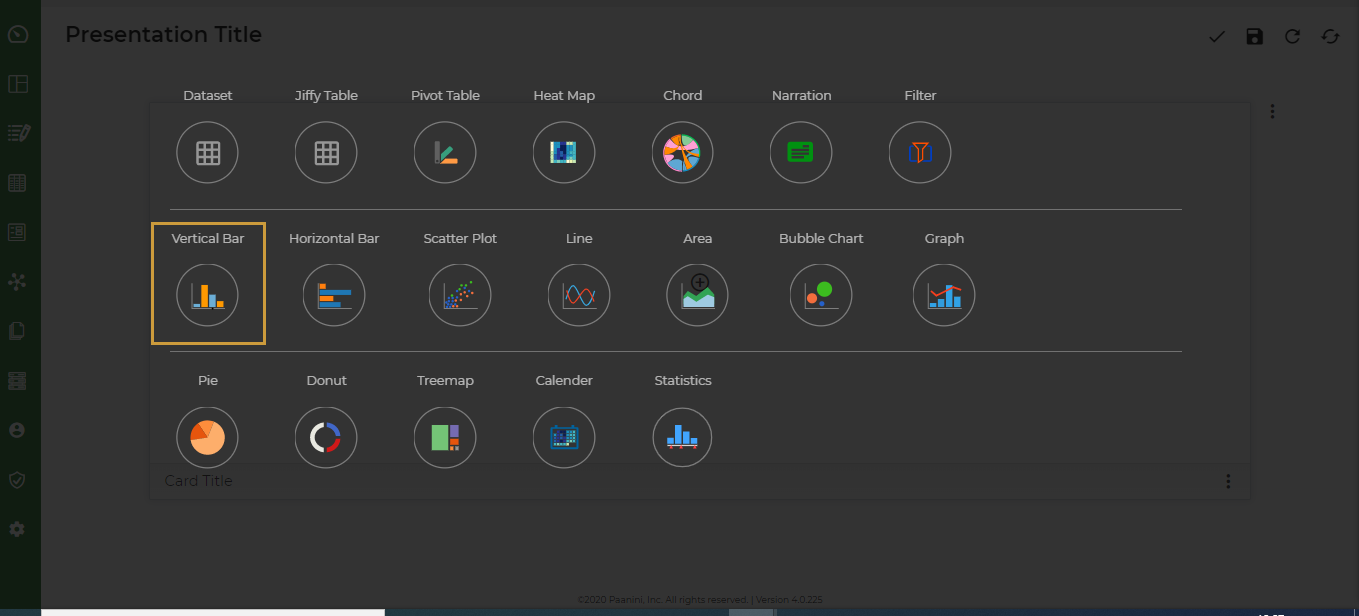
Select Vertical Bar Chart.
To know more about Types of Charts, click here.
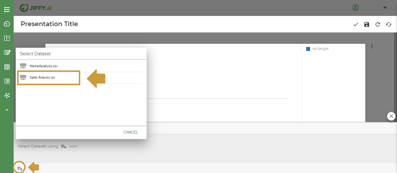
Click the  icon to select the Dataset. It lists all Datasets of the HyperApp.
Select the desired Dataset. All the fields of the selected Dataset are displayed.
icon to select the Dataset. It lists all Datasets of the HyperApp.
Select the desired Dataset. All the fields of the selected Dataset are displayed.
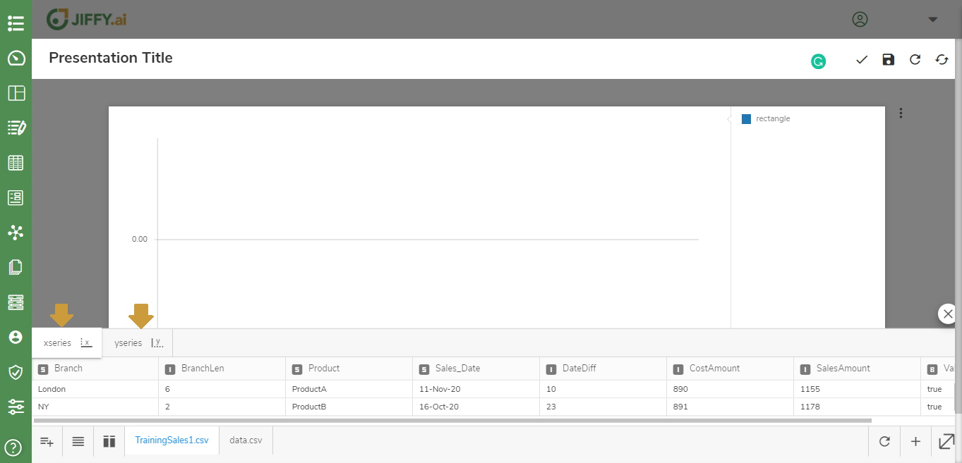
Start plotting the x-series and y-series.
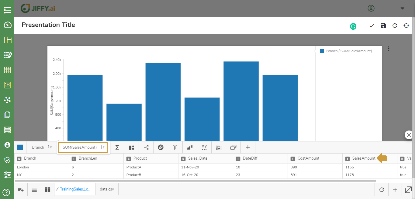
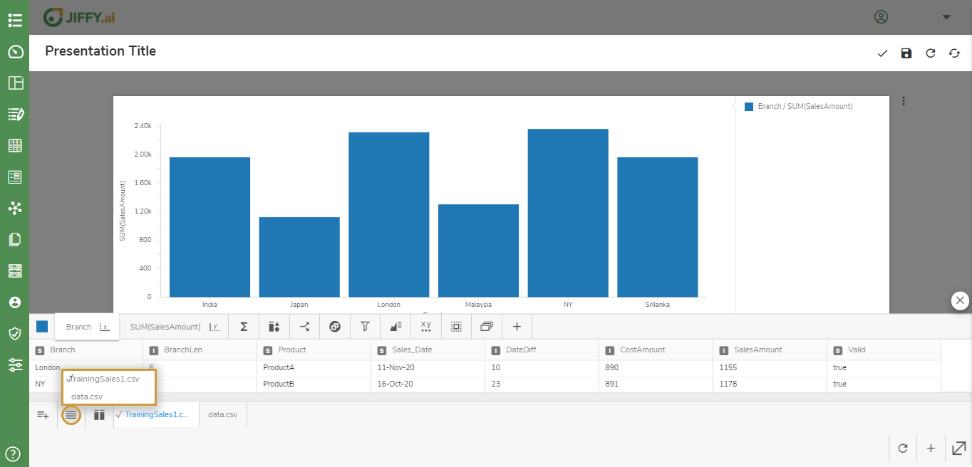
Select Branch for the x-axis.
You can also click the  icon for an easy selection of fields.
Select the y-axis and select field SalesAmount from the Dataset columns.
icon for an easy selection of fields.
Select the y-axis and select field SalesAmount from the Dataset columns.
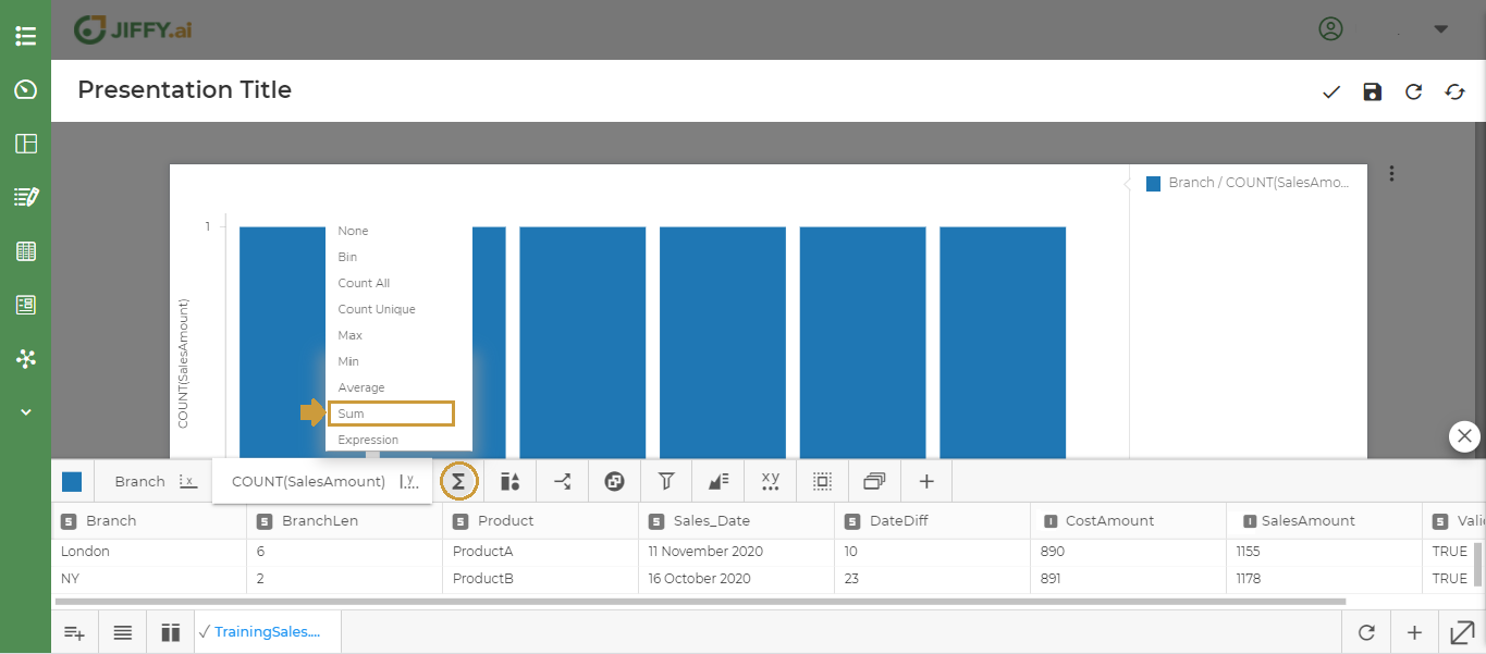
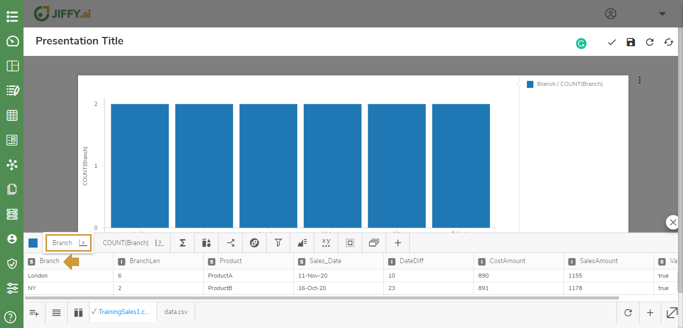
Click the ∑ icon to change the default function. You can choose from the in-built functions or write your own expression.
The functions listed will depend on the field type of the column selected.
For this example, select Sum, to display the Total SalesAmount for each Branch.
In cases where you have multiple Datasets selected for the Chart, click the  icon for an easy selection of the table for which you want to display the fields.
Save the Presentation.
Give an intuitive Title for the Presentation and click the  icon.
icon.
Types of Charts
The different types of Charts are:
- Dataset - Tabular Chart on any of the SQL Dataset, CSV Dataset, Document Table, and Jiffy Table Datasets present in the App.
- Jiffy Table - Tabular Chart on any of the Document Tables and Jiffy Tables present in the App.
- Pivot Table - A Pivot Table Chart is used to summarise the data of the more extensive Datasets present in the App. The summary can include sums, averages, or other statistics, which the pivot table groups together in a meaningful way. It allows users to transform columns into rows and vice versa. It allows grouping by any field and uses advanced calculations on them.
- Heat Map - A Heat Map Chart is a graphical representation of data where values are depicted by color. Heat maps make it easy to visualize complex data and understand it at a glance.
- Chord - The Chord diagram is used to visualize the relationship between various data attributes. It organizes data attributes radially in a circle with the relationships between the data attributes drawn as arcs connecting the data. The size of the arc is proportional to the importance of the relationship between the attributes.
- Narration – A Story or Message Chart with a data snapshot depicting the message.
- Filter - Filter to isolate data values from a large Dataset, based on one or more conditions. Apply on the Presentations, to generate a view for a specific condition.
- Vertical Bar – A Vertical Bar Chart visually displays data using vertical bars whose lengths are proportional to quantities they represent. Used when graphing ordinal variables, for example, Sales Range.
- Horizontal Bar – A Horizontal Bar Chart visually displays data using horizontal bars. The data categories are shown on the vertical axis and the data values are shown on the horizontal axis. The length of each bar is equal to the value corresponding to the data category. Horizontal Bar Charts are used for displaying comparisons between categories of data. Used when graphing nominal variables, for example, Favourite Product.
- Scatter Plot - A Scatter Plot Chart uses dots to represent values for two different numeric variables. The position of each dot on the horizontal and vertical axis indicates values for an individual data point. Scatter Plots are used to observe relationships between variables.
- Line - A Line Chart uses lines to connect individual data points that display quantitative values over a specified time interval. Line Charts use data point “markers” that are connected by straight lines to aid in visualization. A line graph can be quite helpful in depicting the changes in values over time.
- Area - Area Charts are Line Charts but with the area below the line filled in with a certain color or texture.
- Bubble Chart - A Bubble Chart is a data visualization that displays multiple circles (bubbles) in a two-dimensional plot. It is a generalization of the scatter plot, replacing the dots with bubbles. Most commonly, a Bubble Chart displays the values of three numeric variables, where each observation’s data is shown by a circle (“bubble”), while the horizontal and vertical positions of the bubble show the values of two other variables.
- Graph – A Graph for pictorial representation or a diagram that represents the data
- Pie - A Pie Chart is a type of graph that displays data in a circular graph. The pieces of the graph are proportional to the fraction of the whole in each category. The entire “pie” represents 100 percent of a whole, while the pie “slices” represents portions of the whole.
- Donut - A Donut Chart is a variant of the Pie Chart. While the two Charts are quite similar in the way they look and function, the following features of the Doughnut Chart set them apart:
- The Donut Chart has a cut-out center.
- The center of the Donut Chart can be used to render additional information like the total of all data values as well as the data value of the slice being hovered upon. In this case, then, rendering data labels and data values separately are not required.
- TreeMap - A Treemap Chart is used for representing hierarchical data in a tree-like structure. The tree branches are represented by rectangles and each sub-branch is shown as a smaller rectangle. It displays categories by color and proximity and can easily show lots of data which would be difficult with other Chart types. It makes it easy to spot patterns, such as which products are a store’s best sellers.
- Calendar - A Calendar Chart is a visualization used to show activity throughout a long period, such as months or years. They are best used when you want to illustrate how some quantity varies depending on the day of the week, or how it trends over time.
- Statistics - A Statistics Chart is defined as the pictorial representation of statistical data in graphical form. The statistical graphs are used to represent a set of data to make it easier to understand and interpret statistical information.

 You can also click the
 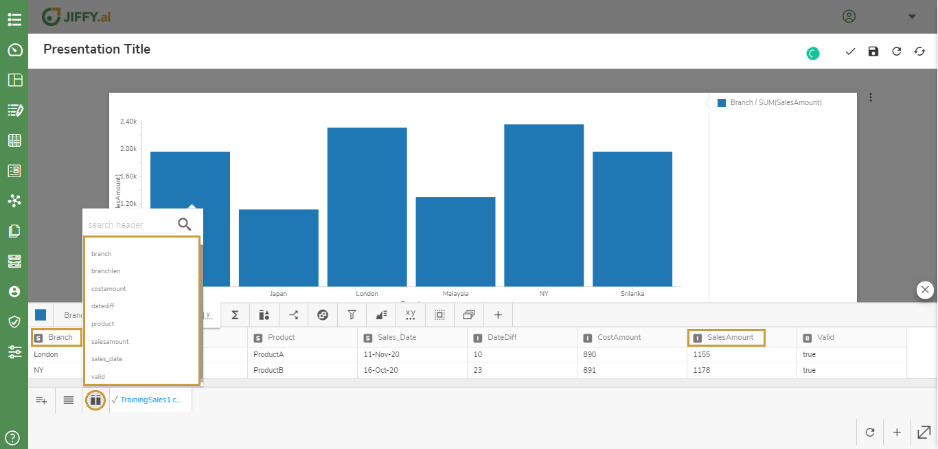 Select the y-axis and select field SalesAmount from the Dataset columns.